The Form Editor is used to define new forms. The forms defined using the Form builder are then added to formlists. The forms are the respective form types that appear in the Data Viewer and in the Mobile Client and the data for each form can then be viewed on a map.
A form in the Form Editor page is organized as a tree. The highest level displays the name of the form; the next level shows the pages of the form and the underlining levels shows the fields (i.e. the questions). The fields/questions can have options below them depending on their type.
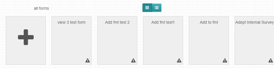
New forms can be created from the all forms tab or within a form list. If created from the all forms tab, they are not associated with any form list. But if they are created in a form list, they are associated with that form list. Click on the plus button shown below in a form list panel or on all forms panel then click on the desired form type. For this section we shall click the “Advanced ” button.
Figure 6: Creating a Main Form
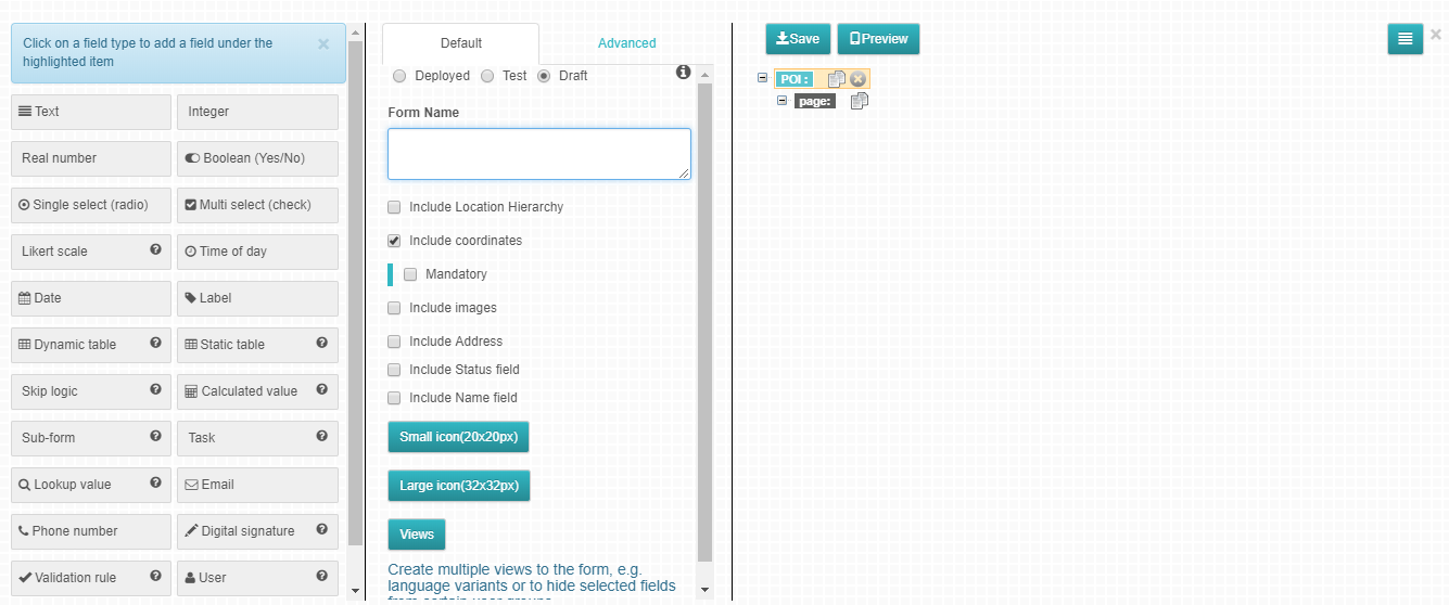
On clicking that button, the page shown in figure 6 below appears.
Name field is common across all the three form types. It records a data point’s name. Name values are used for uniquely identifying a data points in Data viewer and Mobile Client. If it is defined as hidden or not mandatory and thus not filled, a timestamp is used instead.
There are other fields which are important and are hidden by default:
GUID - records the unique identifier of the form
Upload Time - records time the form is uploaded
Device Edit Entry - records the time of data entry on the phone
Phone Edit Time - records the duration the data was edited on the phone
Portal Edit Time - records the duration data was edited in the portal
Portal Edit Entry - records the time of data entry in the portal
Modified Time - records the time data was edited
Form Attributes
Form State
A form can be defined to be in either of following two states
Test - This is the state at which the form can be tested. The form can be added to a formlist, questions can be viewed in both the mobile client and data viewer and even sample data collected. While in this state all form manipulations including deleting the entire form, adding and deleting pages, adding and deleting fields (questions), changing of data types etc. can be done.
Deployed - This is the state at which a form is ready to be used for data collection. When a form is in deployed state, it can only be archived and not deleted. One cannot delete already existing fields or pages but may edit question text without changing data type. If a field is no longer needed, it can be hidden and will no longer be visible in the data viewer and the mobile client.
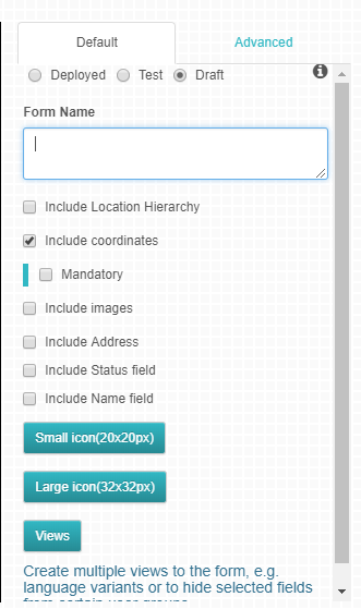
Form Name
The Form name field allows you to give a form a descriptive name. This is also shown in the Data Viewer and in the Mobile Client when selecting to add new data.
Form Options
Forms can have different options included depending on the form type. The following options are common across the different form types:
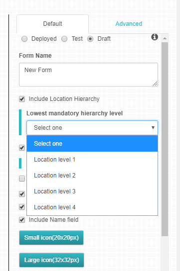
Include Location Hierarchy - Checking this option will include location hierarchy questions if the user group has a location hierarchy associated with it. See section 4 on defining location hierarchies. A location hierarchy can be defined as mandatory by selecting from a drop down the lowest mandatory hierarchy level as illustrated in figure 9 below
Figure 8: Mandatory Hierarchy
Include Images - This attribute allows users to upload images associated with a data point. When collecting data with the Mobile Client, camera icon is presented and it is possible to capture images with the integrated camera of the device and those are automatically attached to the data point. It is also possible to add images through the Data Viewer. Check this attribute to allow users to upload images in a data point.
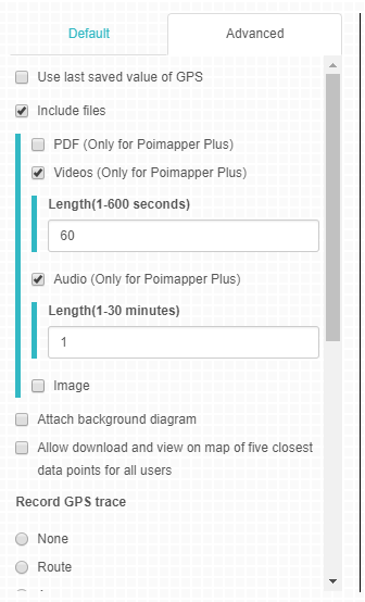
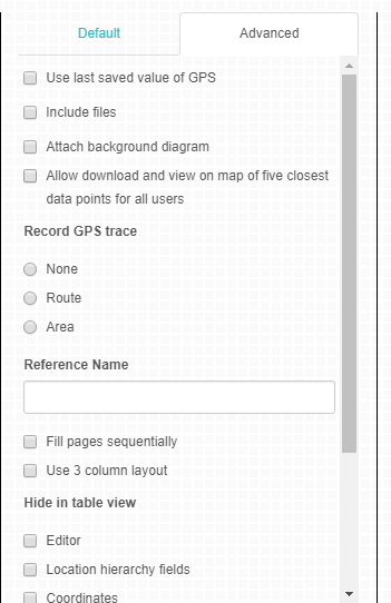
Attach Files (Video/Audio/PDF) - This attribute is found on the Advanced tab and it allows users to upload files associated with a data point. One can select one or more types of files to attach. Allowable file types include:
Videos (Length 1-600seconds)
Audio(Length 1-30 minutes)
PDFs
One can define the length of audio and video files by a number in the text field as illustrated below on figure 9, their preferred length within the specified limits.
Figure 9: Define Audio and Video Length
When collecting data with the Mobile Client, an attach file icon is presented and it is possible to attach afile to the data point. It is also possible to add files through the Data Viewer. Check this attribute to allow users to upload files in a data point.
Include Address - Checking this option would include address fields to the form. The
address fields include:
State/Province
Address
City
Zip Code
All above Fields will have internal names which are fixed and visible names can be edited. The fields will be of type text. This attribute will enable one to geo code addresses to longitude and latitude when importing data.
Include Coordinates - Checking this attribute includes the functionality to collect gps coordinates information during data collection. Including coordinates can be made mandatory by checking the Mandatory checkbox
below the include coordinates options.
Figure 10: Include Cordinates Mandatory
Data Point Icons Upload
This is an optional step. If needed, one can upload an icon to be used as data point markers in map view. If you choose to have a custom marker then you will be required to upload a small and large image of the icon (marker) to be used by clicking Small icon and Large icon buttons respectively. The file format recommended is png
. For small icon, required size is 20 x 20 px.
For large icon, required size is 32 x 32 px
Note: If no icon is provided, one will automatically be created for you.
Record GPS trace
This attribute, is found on the Advanced tab section, as the name suggests it records the GPS trace of a form. As shown in figure 11 below, there are three options:
None- Checking this option, no trace will be recorded.
Route- This option denotes route question for root tracing on a map
Area- This option denotes area tracing question for map display
Figure 11: GPS Tracing
Other Attributes
There are other attributes that appear on the advanced tab like;
Fill pages sequentially- Checking on this attribute only allows one page to be filled completely before starting to fill the next one.
Use 3 column layout- Checking on this will allow questions on data viewer to be viewed in 3 columns instead of the normal 1 column view
Hide in table view- this attribute allows you to decide what fields should be seen or hidden on table view on Data Viewer.
Include Files- This option allows you to include files in form of PDF, Videos, Audio or images to the form created. This is discussed further in the next section under Advanced tab options.
Upload completed Word Template- The word template enables you to design a word document report template that can be used to generate report for each Data Point individually. This is done by using defined properties within the document.
The properties are of the form
pm:reference_name
where reference_name is the Reference Name for a Question within a Form as defined in the Form Builder.
If you want the answer for a question to appear at a specific point within the document, place the property at that point. The property should be enclosed in curly brackets e.g.
{pm:name}
Subforms Questions
Subforms Questions can also be included in the template. Where the Subform should be placed, place the marker
subform:reference_name
where reference_name is the Reference Name of the Subform question as defined in the Form Builder.
The subform questions can then be defined after the placeholder.
After the Subform fields are defined, place the placeholder :
subformend
to indicate the end of the subform. All the instances of the Subform will be duplicated based on the number of instances that exist.
Table Questions
Table Questions should be defined in a Word Table Structure. At minimum the table defined should have one row.
Before the table, place the placeholder
table:reference_name
where reference_name is the Reference Name of the Table question as defined in the Form Builder.
Within the table you can place the reference names for the table columns. Immediately after the table, add the marker
The table row will be duplicated based on the number of rows in the table data.
tableend
To refer to the table columns and subform questions, use the format
{pm:<ref1>.<question_reference>}
ref1 – This is the reference name for the subform or table question
question_reference – This is the reference name of a table column or a question within the subform.
For Static table, to refer to the name of a row, use the reference for the name question which is name.
Table Questions defined in a Subform can also be included between the subform placeholder. For example, if we have a subform with reference name subform and table with reference name tab1, the template can be defined as
subform:subform
table:tab1
// define table here
tableend
subformend
Images
To include an image that has been captured with a POI, add the property
{pm:images}
where you want the images to appear.
Background Diagrams
If you are using background diagrams as the base map for your subforms, you can include an image of the background diagram with the position of each subform.
To do so, for each subform question that uses the background diagram, include the property
{pm:reference_name.diagram}
within the subform table.
reference_name is the reference name of the subform question
6. Upload comleted Excel Template- The Excel template enables you to design a Excel document report template that can be used to generate report for each Data Point individually. This is done by using defined properties within the document.
(Note: The commands used to create a Word Template are the same ones used to create an Excel Template)
For both Templates (word and Excel), there are options to remove the uploaded template and opening the exisiting template from the server which automatically downloads the current template.
Attach background Diagram- This is an option that allows you to use a base map for you forms (main form, subform, task form) instead of the normal global map. The base maps are uploaded from the data viewer end and the same has been discussed more on the Data Viewer User Manual.
Enable Adding form to diagram - once you decide to use a base map by checking on attach background diagram, checking on this option will mean that it will be possible to add co-ordinates to the added diagram.
Allow download and View on map of five closest data point for all users:- this options allows the user to download the five closest data point on the Mobile Counter Application.
Webhook- Allows Poiampper to Push data to an endpoint you define in this field every time a datapoint is saved in Poimapper.
The data would be sent as a JSON object using POST method. The data would be contained in the body of the request.
The structure of the data would be based on the questionnaire form defined. The keys for the JSON object would be the internal ID for questions as defined in the Questionnaire form XML.
Ensure that the endpoint defined in the webhook url field does not require any authentication to receive data.
You can also access data from Poimapper by pulling data using our API. To achieve this, contact us through our support email.
Attach Page Background(Only for the Child UI) - This option enables you to add an image that will be displayed as a background image when the child UI option is selected on the app.
Header - This option allows you to add a header that will be displayed at the top of every page on the app when the Child UI option is selected.
Attach Header Image - This option allows you to add an image that will be diaplyed as a header at the top of every page when Child UI is enable on the app.
Scheduled Status - When this option is enabled status options: Unscheduled, Scheduled, Ongoing and Done are added to the form. This allows for a data point being created to be scheduled, even if it’s not added from from the Schedule View.
Can not be used to add new data - When this option is enabled, users can no longer add data to the said form, it will only be possible to view data.
Create Subform Clone - When this option is enabled, a subform version of the current frm is created that can be used as a normal subform, and the current form with the option selected cannot have subforms itself.
Show data per page - When enabled, data will be displayed a page per time.
Data is read-only - When enabled, no more data points can be added to the form and all data that had previously been added to the form cannot be edited.
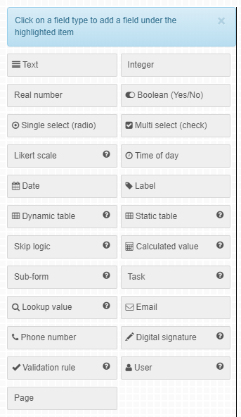
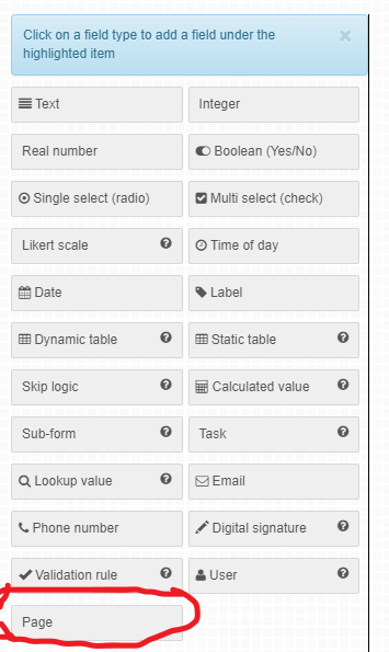
After defining a new form the next step is to define its fields according to the questions desired for the form. New fields of various types can be added to the form to accommodate different types of questions.
To add a new field to a form, navigate to the field type panel(shown in figure 12 below), click on the specific field type you want to add then name it.
It should be noted that, when adding a new field, something must be selected on the form on the workspace either the form node, page or another existing field. Where the new field will be positioned depends on the current node that has been selected on the workspace.
When a form node is selected the field will be added to the last page of the form, when a page is selected the field will be added as the last field in the page, when a field is selected, the new field will be added below the selected field.
Figure 12: Adding New Fields
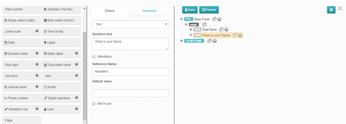
If you happen to pick a field type that you didn’t intend to, this can be changed in the attributes panel. See figure 12 below. It is recommended that the fields are named so that the name reflects the purpose of the field or the intended question.
Figure 13: Change Question/Field Attribute
The attributes panel is divided into two tabs:
Default Tab
Advanced Tab
Default Tab
The following attributes are available in the default tab:
Mandatory - By default questions are not mandatory unless explicitly defined to be so by checking the Mandatory check box. If a question is marked as mandatory,then the answer to the question must be provided during data collection before the form is saved. An alert will be shown if one attempts to save a form having left a mandatory field / question blank. In mobile client, it is possible to save as a draft but not possible to upload to the server before filling all mandatory fields.
Not in Use - When this option is checked the question is hidden both in the web portal and mobile client application.
Reference Name - A reference name is a specific unique name given to a specific question/field, it can be defined for a question so that the collected data can be exported to an SPSS analytical system for further analysis.
Default Value - Used to denote the default value for a question e.g. for a Boolean question one can set the default value to be “yes” and every time that question is shown either in the web portal or mobile client application the “yes” option is marked true. This also applies on select questions and also integer questions where you can set a certain number e.g 0 as the default value. Value can be changed to something else by the data
collector. The default value can also be used as hints for text questions.
Advanced Tab
The Advanced tab offers more alternative options some of which are specific to the different field types while others are generic.
The table below explains some attributes in the Advanced tab section.
Attach Image to Question: - Used to allow attachment of an image to specific questions. In data viewer, the images are shown in single instance view next to the question. In mobile client, a camera icon is shown next to the question. On clicking the camera icon the images attached to the question are shown.
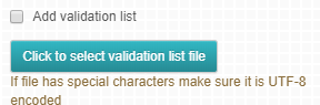
Add Validation List:- Used to specify allowable values in a text field.
Figure 14: Add Validation List
When this option is checked a button select file is shown which enables the modeler to browse the local drive for a .txt or a .csv file with the validation list. When filling data, the user is shown a single select input with the validation list to choose from.
Sometimes a user might want to add data that is not on the validation list, so how do we go about this? In the text field, type the data you want. An option to Add the new data will be shown just below the text input field, Click it and your data will now appear in the validation lists.
Hide in device: - When this option is checked, the question is hidden only in the mobile client application.
Hide in Table View: - This option allows for a question to be hidden in the table view on Data Viewer
Hide in Single Instance View:- When selected , the specific question won’t be visible on single instance view on Data Viewer
Hide in Export: - This option makes it possible to hide a question on the exported file .
Read only in device:- When this option is checked then the specific question will only be viewed but it won’t be possible to edit it on the mobile client application
Attach Image/Video:- This option allows the user to add an Image or a video to a specific question.
Preserve Value when re-scheduling:- when this option is checked the last value used for this field will be maintained when adding a data point to schedule.
Enable Bar code scanning for this field: - Checking on this option makes it possible for scanning of bar code with a Qr or bar code scanner for that specific question.
Numeric Options Code: - This option appears under likert, select and Multiselect field types. When checked, it allows for only numeric data field to be filled on the option code section.
Allow only one subform to be filled: -This option appears under subform field, checking on it allows for only one subform to be filled for one data point.
Clear Yes branch data if condition is false and No branch if condition is true:- this option as self explanatory as it is , is found aunder the boolean field type.
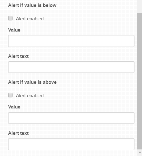
Alert on maximum and minimum values: - Used to give user alerts based on maximum and minimum values set. This only applies to numeric fields.
Figure 15: show alert
To show alert tick the alert enabled check box, enter the value and alert text to be displayed.
Use last saved value: - The last value which was saved for this field will be used as the default value
for the field when adding a new POI.
Can Edit/Can View- This option allows you to choose the type of user (ordinary, enumerator, viewer) that can be able to view and/or edit a specific question.
Attach image/audio/video- Unlike the include file otpion that allows you to add files from the Data Viewer end, this option allows you to attach a file that will be displayed under that specific question you’ve added the image on.
Salesforce Field: - This is an option that allows you to define a field you creating as a salesforce.com field
Salesforce Integration Implementation
Salesforce integration works such that when data is saved in Poimapper, it can also be saved to Salesforce directly. When data is updated in Salesforce, the same can then be updated in Poimapper.
Linking Form to Object in Salesforce
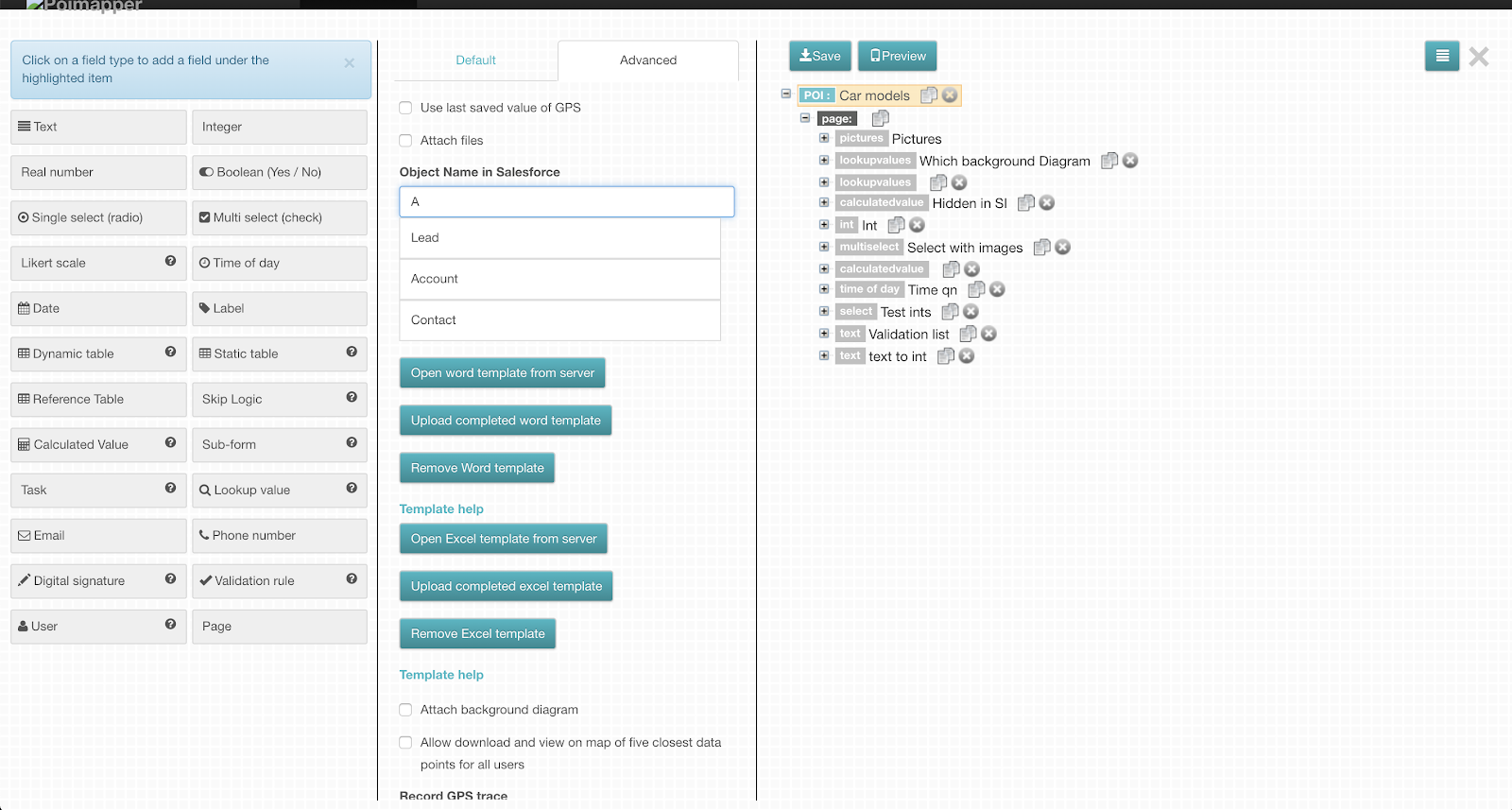
To link a form to an object in Salesforce, this is done in the form builder.
From the form builder in the advanced tab of a form, select the Salesforce object to which the form should be linked to. Supported Objects at the moment are Opportunity, Lead, Contact & Account.
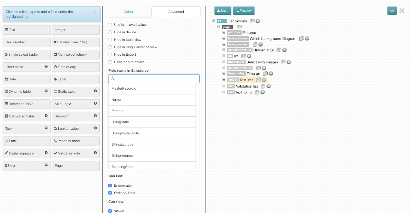
The form fields can then be linked to specific fields for the selected object. For each form field in the advanced tab under the Salesforce name attribute, select the Object field to which it should be linked to.
Once the form is saved and added to a formlist, when data is added/updated for the given form, the same would be saved to Salesforce.
Select the object which will be linked to the form
Figure: Select the object which will be linked to the form
For the fields in Poimapper, select the corresponding field name in Salesforce
More Information on how data from salesforce can be updated on Poimapper has been given on the admin tool manual.
The form fields can then be linked to specific fields for the selected object. For each form field in the advanced tab under the Salesforce name attribute, select the Object field to which it should be linked to.
Once the form is saved and added to a formlist, when data is added/updated for the given form, the same would be saved to Salesforce.
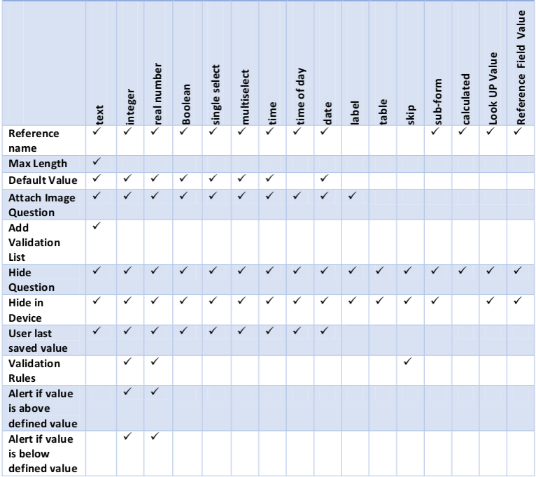
The table below shows the matrix of form data types against applicable attributes.
Figure 16: matrix of form data types against applicable attributes
The following sections give a detailed explanation of each field type in the Form builder. The fields appear as questions in the web portal and the mobile client application.
This type of field defines a text box which allows all types of characters to be typed in. The default value option is used to set a specific word or just set o laters that can be diaplayed before a user fills in that section, can be used to denote a hint
On the advanced tab of the same, we have features like:
Maximum Length: - Used to denote the maximum characters allowed for a string of text.
Regular Expresion: - This option allows use of special text string for describing a search pattern.
Add Validation list: - This option allows uploading of a csv file containing a column with a list of options which will be displayed as a down list when a user is filling in the text field.
Enable multichoice: - Once the ‘Add Validation list’ option is selected, this option is displayed. When selected, it allows for multiple options to be selected from the validation list drop down.
Convert to text: - Once attaching audio file to a text field has been enabled, this option is displayed. When checked, the user’s submitted audio content is transcribed and displayed on the text field in the data viewer.
Show this in the selection list of subform instances in the parent form:- This option is only seen on text fields in sub-forms. When enabled, the sub-form is listed with the content of the text field as the label. This text can be used to search the sub-form from the sub-form list as well.
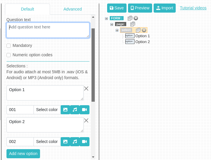
This allows a field to be created where the response can only be one of the options defined. The options are added in the “Selections” panel by clicking the ‘add new option’ button, as shown in the figure below. The options ought to be given names that depict the options being added. Enter the name in the text box provided.
Figure 17: Adding Options
Note 1: For this question type, several sublevels of conditional questions also known as sub questions can be added.
Note 2: An explanatory file can be added to an option. This file could either be an image, audio or video. This is done by clicking the respective button besides the option code and selecting a file from the local drive.
Note 3: The ‘Other Text’ checkbox adds a default option which allows data collectors to enter an option that is not in the above defined options list.
Note 4: To remove an option click on ‘x’ next to the option.
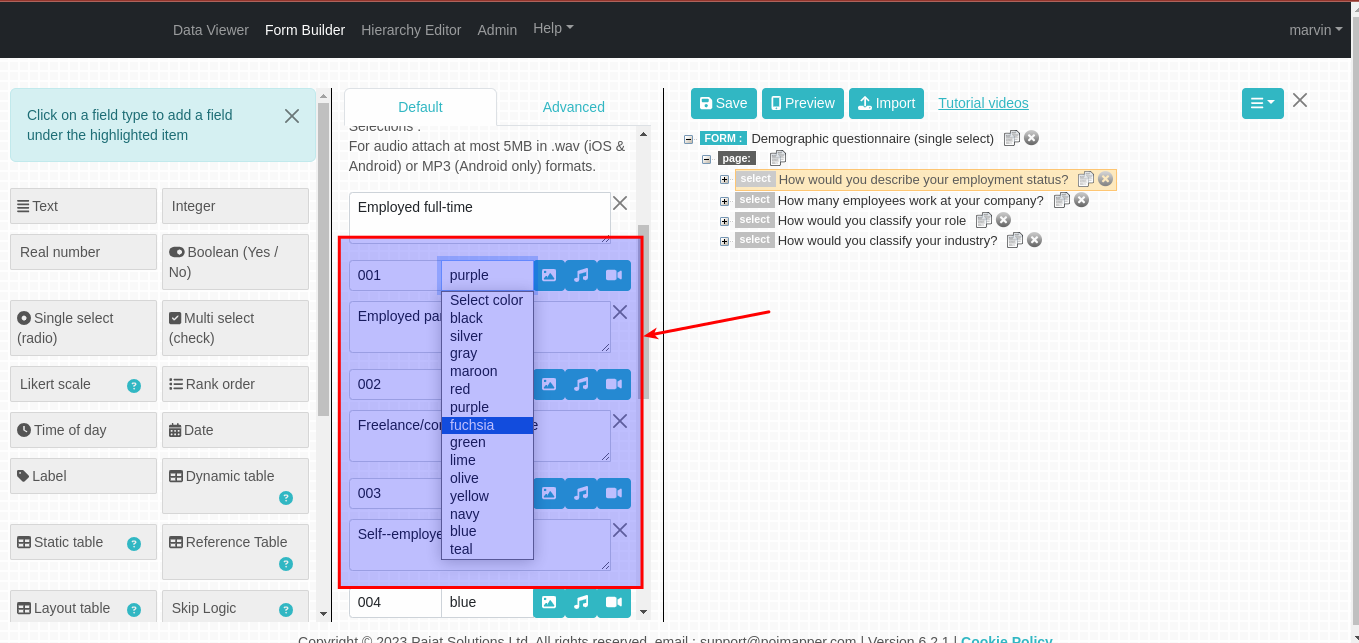
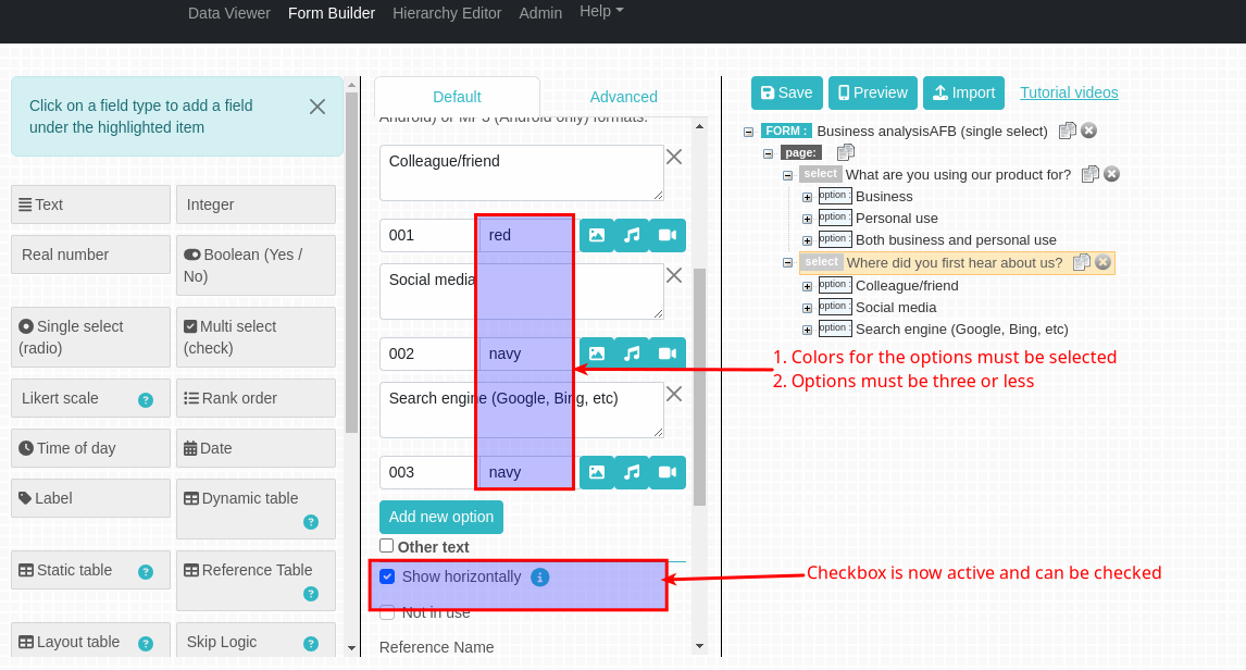
Select color for single select questions
The select color feature allows a user to define colors for the single select options. On clicking the select color dropdown, a list of colors will be displayed from which a user can select a color of their choice. This feature is also useful for charts because bars or lines related to the option will be displayed in its defined color.
Figure 17.1: Selecting colors from dropdown
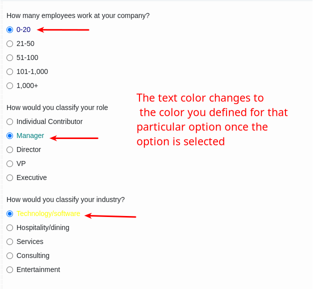
Once the colors for the options are defined and the form has been saved, The user can now see the text colors change for the single select options once they are selected when adding data to the form.
Figure 17.2: Text color changes on selecting an option
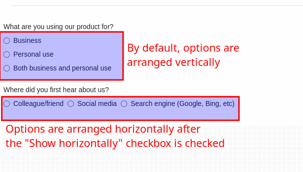
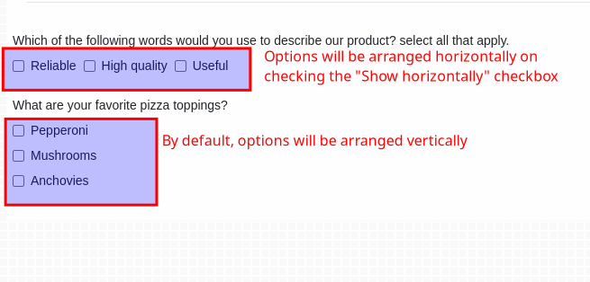
Show horizontally -
By default, options added to a single select questions will be arranged vertically in the form. This checkbox gives the user who would prefer the options arranged horizontally the power to do that. See the difference in figure 9.3
Figure 17.3: How options will be arranged horizontally
By default, the Show horizontally checkbox will be disabled. To enable the checkbox, the following conditions have to be met:
All the options for the single select question must have a color selected for them.
The options should not be more than three.
Figure 17.4: Enabling the show horizontally checkbox
This allows a field to be created where the response to the question can be one or more of the options defined. The options are defined in the “Selections” panel similarly to single select data type by clicking the ‘add new option’ link as shown in Figure 13 above. The options ought to be given names that depict the options being added. Enter the name in the text box provided.
Note 1: For this question type, several sublevels of conditional questions also known as sub questions can be added.
Note 2: An explanatory file can be added to an option. This file could either be an image, audio or video. This is done by clicking the respective button besides the option code and selecting a file from the local drive.
Note 3: The ‘Other Text’ checkbox adds a default option which allows data collectors to enter an option that is not in the above defined options list.
Note 4: To remove an option click on ‘x’ next to the option.
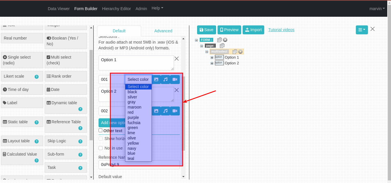
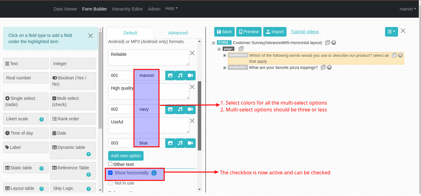
Select color for multi-select questions
The select color feature allows a user to define colors for the multi-select options. On clicking the select color dropdown, a list of colors will be displayed from which a user can select a color of their choice. This feature is also useful for charts because bars or lines related to the option will be displayed in its defined color.
Figure 18: Selecting colors from dropdown
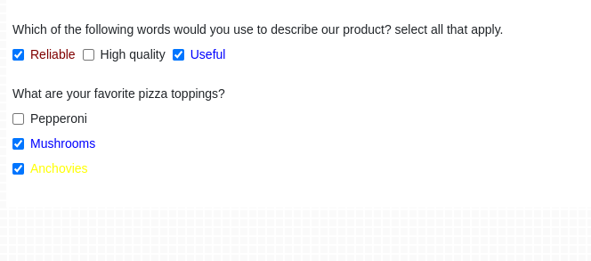
Once the colors for the options are defined and the form has been saved, The user can now see the text colors change for the multi-select options once they are selected when adding data to the form. See figure 10.2
Figure 18.1: Text color changes on selecting an option
Show horizontally -
By default, options added to a multi-select questions will be arranged vertically in the form. This checkbox gives the user who would prefer the options arranged horizontally the power to do that. See the difference in figure 10.3
Figure 18.2: How options will be arranged horizontally
By default, the Show horizontally checkbox will be disabled. To enable the checkbox, the following conditions have to be met:
All the options for the multi-select question must have a color selected for them.
The options should not be more than three.
Figure 18.3: Enabling the show horizontally checkbox
This allows a field to be created where the response to the question can either be true or false or ‘yes’ or ‘no’.
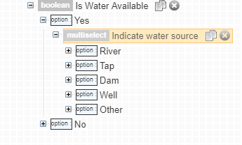
Note: It is also possible to add a conditional/sub question following a given Boolean response for example, if water is available (‘Yes’), then the user is asked to indicate the water sources, as shown in figure 19 below.
Figure 19: Conditional Questions For Boolean Data Type
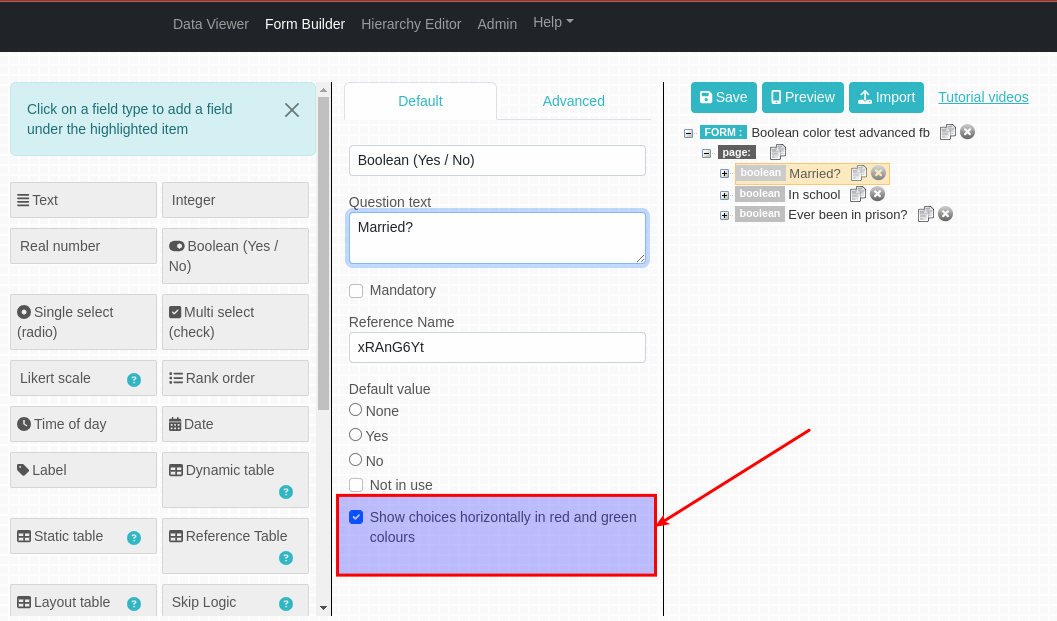
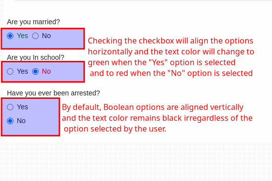
Checking the Show choices horizontally in red and green colours checkbox will align the boolean options horizontally when adding data to the form.
Figure 19.1: Show choices horizontally in red and green colours checkbox
Also, on Selecting the Yes option, the color of the text will change to green and on Selecting the No option, the color of the text will change to red. See figure 19.2 below.
This type of field allows only whole numbers to be entered (i.e. numbers without decimal points). For example, 10 is an integer but 10.0 is not an integer, though they may be equal.
On the advanced option of this field, you can specify the valid range of values for the field by specifying the minimum value below which a user is given an alert that you specify and the maximum possible value.
On the advanced tab, you can set a target value that will draw a target line using this value on numeric line charts if the integer is selected as the Y-axis in a non-combined chart
This type of field allows whole numbers as well as numbers with decimal places to be entered. Like the Integer Number field, the advanced options of this field provide an optional functionality:
On the advanced tab, you can specify the valid range of values for the field by specifying the least possible value below which a user is given an alert that you specify and the maximum possible value.
On the advanced tab, you can set a target value that will draw a target line using this value on numeric line charts if the real number is selected as the Y-axis in a non-combined chart
This type of field allows a set of questions to be viewed based on the response of another question. This feature is only supported on the Html 5 version of mobile client.
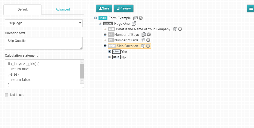
With a Skip Logic question type you can define rules which will determine whether specific questions are asked. The rules are such that they can either be true or false. If the condition is satisfied then the questions under Yes will be displayed. If the condition is not satisfied, the questions under No will be displayed. The Reference Name prepended with ‘_’ is used to refer to values of questions.
Examples:
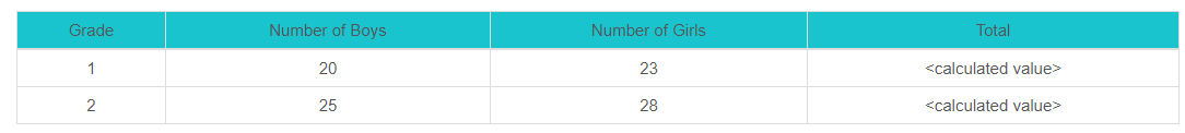
We have two questions: number of boys and number of girls. We want to return true if the number of boys is greater than number of girls and false if it isn’t.
Below is a sample rule which can be defined
_numboys > _numgirls
numboys is the Reference Name for Number of boys question and numgirls is the Reference Name Number of girls question
To perform calculation, e.g. to check if school population is greater than 1000
(_numboys + _numgirls) > 1000
To check if a single select option has been selected, e.g. Select type of school: Public, Private, Community with Option codes 001, 002, 003 respectively and with Reference Name typesch
_typesch == ‘002’
To check if either two of single select options have been selected, e.g. Select type of school: Public, Private, Community with Option codes 001, 002, 003 respectively and with Reference Name typesch and you want to check if either private or community has been selected
_typesch == ‘002’ || _typesch == ‘003’
To check if a Multiple select option has been selected, e.g. Select the sources of water: Pipe, Roof, River with Option codes 001, 002, 003 respectively and Reference Name facility
_facility.indexOf(‘001’) != -1
To check if one of two or more options have been selected the syntax will be
If option codes are not defined, then option texts will be used when evaluating the skip logic statements.
To check if a boolean option has been selected, e.g. Can you drive? with Reference Name driver
For Yes :
_driver == true
For No :
_driver == false
Figure 20: Skip Question
Note 1: An (_) underscore is written before the reference name.
Note 2: The allowable operators are as shown below
== equal to
=== exactly equal to (equal value and equal type)
!= not equal
!== not equal (different value or different type)
> greater than
< less than
>= greater than or equal to
<= less than or equal to
On the advanced tab, there’s an option where you can decide to ‘Clear Yes branch data if condition is false and No branch if condition is true.
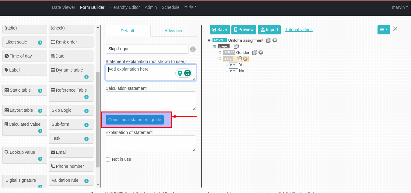
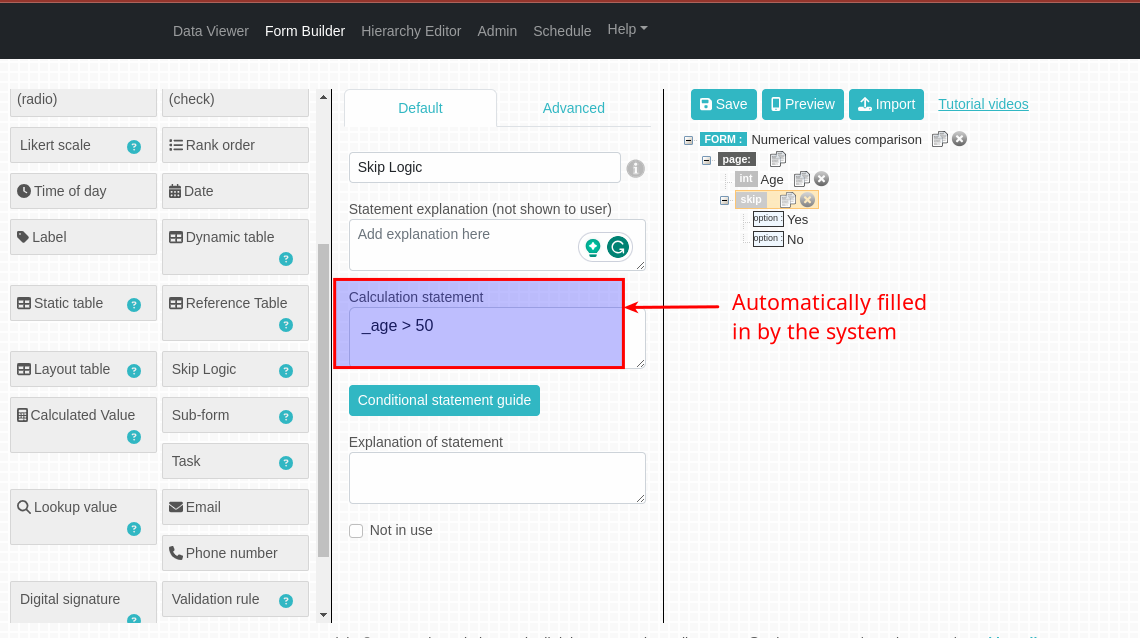
Conditional statement guide
This is a button that appears on selecting a skip question in the form builder. As seen above, Writing skip logic calculation statements can be confusing especially for a new user.
With this feature, users will only be required to set a condition and the system will generate the calculation statement for you. This makes generation of the calculation statement easier, faster and less prone to human errors that can be devastating to users.
Figure 20.1: Conditional Statement Guide Button
To generate the calculation statement, Click on the conditional statement guide button.
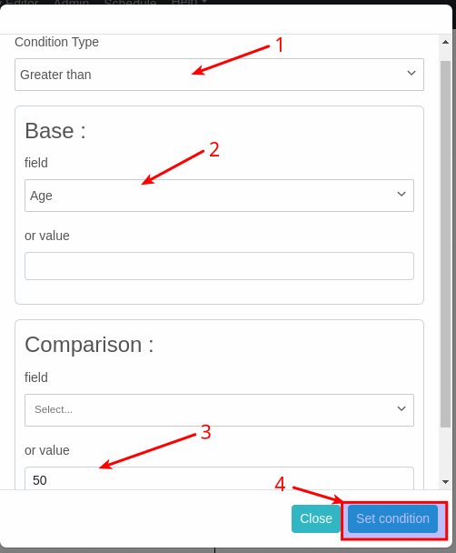
A modal with condition types will pop up, select a conditional type from the list. The conditional types are grouped as follows:
Numerical values comparison
Operators found in this category include: Greater than, Greater than or equal, less than, less than or equal, Equal and Not equal. This category allows us to compare numeric fields.
On selecting any of this operators, Base and Comparison fields will appear.
example 1: If we want a calculation statement that checks if age is greater than 50, on the Base field we will select the age field.
On the Comparison value field we will now input the 50.
Figure 20.2: Setting condition for numeric values
On clicking the Set condition button, the calculation statement will be generated and automatically filled in the calculation statement field.
Figure 20.3: Auto-generated calculation statement
Check boolean
In this category, we have Boolean true and Boolean false. Select either of the two depending on your expected result. Select the boolean question and click Set condition to generate the calculation statement.
Check options
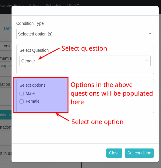
In this category we are mainly comparing the single and multi-select questions. You can either choose selected option or Not selected option.
A modal will then appear where you should select a question from the list. Only single or multi select questions will be shown in this list. On selecting a question, options in that question will be shown. Check the option you want and click the Set condition button.
Figure 20.4: setting condition for select questions
Check for the same or different text
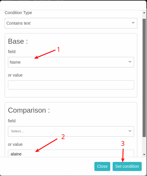
In this category we compare the text fields. It has Contains text option and Does not contain text. On the Base field, select the text question you want to compare. On the comparison value, input the string you want to compare the Base field with. Click on the set condition button. The calculated statement will be generated and filled in.
example 1: To check if the name the user gives has the name alaine. First we will select contains text from the condition type select box. On the Base field we will select the name field.
On the Comparison value field we will now input alaine.
This type of field allows the name of a data point instance to be entered. The name field is predefined in the form by default and not user defined. A form may only have one name field.
This type of field defines a static label that can be used to give instructions to the people collecting the data or denote a heading or other purpose as may be desired by the modeller.
It should be noted that it is possible to attach and add files to this field too as it is on other field types.
Markdown styling methods can be used on the label field for further editing of the label contents. The basic markup formatting options is explained below.
Basic Markdown Formatting
Poimapper is Markdown Formatting enabled. Markdown is basically a way to style text on the web. With it you get to control the display of the document, formatting words as bold, italic e.t.c. In this case, it’s mostly used on the label field.
Here are some of the Basic Markdown formatting commands that you can use;
Headings
Headings in Markdown are any line which is prefixed with a # symbol. The number of hashes indicates the level of the heading. One hash is converted to an h1, two hashes to an h2 and so on.
# Heading 1
## Heading 2
### Heading 3
Text
italics
To italicize text, add one asterisk (*) or underscore (_) before and after a word or phrase. To italicize the middle of a word for emphasis, add one asterisk without spaces around the letters.
bold
To bold text, add two asterisks(**) or two underscores(__) before and after a word or phrase. To bold the middle of a word for emphasis, add two asterisks without spaces around the letters.
*bold-italics*
To emphasize text with *bold and italics* at the same time, add three asterisks (*** ) or three underscores (___) before and after a word or phrase. To bold and italicize the middle of a word for emphasis, add three asterisks without spaces around the letters.
***code***
___code___
_This is for ***emphasis** in the middle_
To denote a word or phrase as code, enclose it in backticks (`)
Blockquotes
To create a blockquote, add a > in front of a paragraph.
Lists
You can organize items into ordered and unordered lists.
Ordered Lists
To create an ordered list, add line items with numbers followed by periods. The numbers don’t have to be in numerical order, but the list should start with the number one.
1. First item
2. Second item
3. Third item
4. Fourth item

1. First item
2. Second item
3. Third item
    1. Indented item
    2. Indented item
4. Fourth item
Unordered Lists
To create an unordered list, add dashes (-), asterisks (*), or plus signs (+) in front of line items. Indent one or more items to create a nested list.
*First item

*Second item

*Third item

*Fourth item
Starting Unordered List Items With Numbers
If you need to start an unordered list item with a number followed by a period, you can use a backslash (\) to escape the period.
*1968\. A great year!

*I think 1969 was second best.
Paragraph
To create paragraphs, use a blank line to separate one or more lines of text.
Line Breaks
To create a line break or new line (<br>), end a line with two or more spaces, and then type return.
Links
To create a link, enclose the link text in brackets (e.g., [text to display]) and then follow it immediately with the URL in parentheses (e.g., (http://www.poimapper.com)).
Whereby the ‘text to display’ is the text you want to be displayed in place of the whole link.For example, to display the link http://www.poimapper.com , to be displayed as just one word ‘POIMAPPER’, you’ll note down the command as:
Static Table is a table whereby the modeler defines a fixed number of rows and columns when creating the form and once saved you won’t be able to add a row/column on the Data Viewer while answering the questions.
On selecting the static table field type, two fields are shown on the tree beneath the table question, one for Columns and another for Rows.
To define Columns in a table question, select the Columns tree node, then click on the field type on the left that you wat to add as a column. When a column is selected on the tree, you can also click on a field type to add it to the table.
To edit the rows, click on the Rows node on the tree. On the right panel, click on the Add Row button to add a row.
Row Value in Static Tables : Each row has a field row value which is referable in calculated values with refernce name _rowvalue
Dynamic table are table questions with no predefined number of rows. When filling in data, the user can add as many rows as they wish.
To define the columns for a dynamic question table, select the columns node on the tree then click on the field type that you wish to add as a column.
Columns can also be added when a column has been selected on the tree
Operation : This is an option that is shown under Advanced tab for numeric table fields that allows you to decide on the operation that should be applied on the numeric column , either none, sum or average, whereby the results (for either sum or average) would be displayed at the footer
Attach icon for field- This is an option, under integer fields on Tables, that allows an icon to be added that will be visible on data viewer
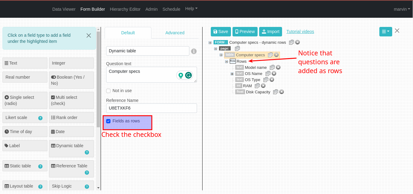
Fields as rows checkbox
By default, a dynamic table will allow you to define table questions as columns and when filling data the user can add as many rows as they wish.
Clicking this checkbox allows you to define table questions as rows and the user will input data as columns. The number of columns are not predefined and the user can add as many columns as they would wish.
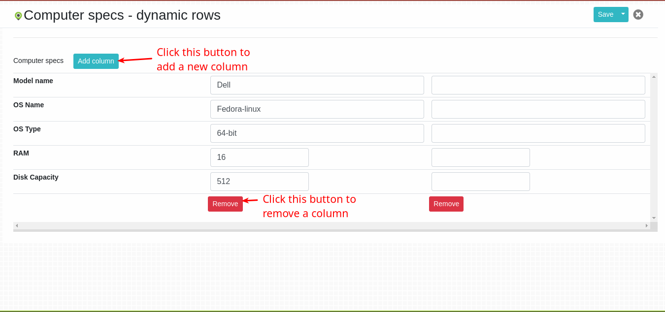
Figure 21: Dynamic table with table questions as rows
When adding data to the dynamic table, you will see the Add column button. Clicking this button will add a new column for the user to fill in the data. A user can add as many columns as they would want.
Below every added column, there will be a Remove button that will allow you to remove columns that you no longer want in the dynamic table.
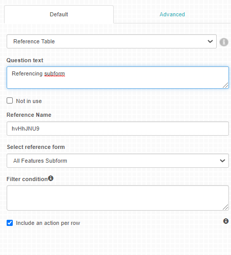
Reference Table as the name suggests is a table that contains columns which refers to a subform within a form or data from another form within the formlist. The unique features of the reference table include:
Possibility of referencing a subform/another form on the table
Use of calculated values to reference specific data
To define the columns for a reference table, select the columns node on the tree then click on the field type that you wish to add as a column.
Columns can also be added when a column has been selected on the tree
Figure 22: Reference Table
As shown on the figure above, after adding a reference table there is a field ‘select reference form’ whereby you get to choose a form/subform that you want referenced on the table.
To refer to questions in the form/subform as a column in the reference table, add a calculated value question for each question you wish to refer to. For each calculated value question, add the reference name of the question you wish to refer to as the script value. It should be preceeded with _refName where refName is the reference name of the selected form/subform.:
_form.name
Rows for Reference Table
Each row in the table references a form/subform instance which the question has been linked with within the form.
Below the select reference form, there is the ‘Filter Condition’ text box where you are expected to fill in a condition that will be used to filter the subform questions that will be displayed on the refeerence table.
Currently only a single comparison condition is allowed.
To filter the values that should be added to the reference table, you can write any condition in the condition field of the reference table field. You can refer to fields in the form/subform which has been linked to the field using their reference name. This is done the same way it is done for Skip Questions logic. For example, if the subform has a field population with reference name popul and we want the reference table to only contain instances where the population is more than 10 the condition will be like this:
_popul>10
If the reference table is linked to a main form, the filter condition can refer to fields in the current form (which has the reference table) and also fields in the referenced from. To refer to the linked form, the statement should be of the form:
_{formReferenceName}.{questionReferenceName}
If the form reference name is formA, to refer to the name question with reference name as nameRef, the statement would be:
_formA.nameRef=='dummy'
Or to compare with a question in the current main form with the reference name nameMain, we can use:
_formA.nameRef==_nameMain
Referencing fields in Calculated Value Questions
If you want to reference a question from the Subform within the table, add a column of question type Calculated Value. The written condition should point to one question only. The format of the condition will be
_subformRef.questionRef
subFormRef - This is the reference name of the Subform at the form level
questionRef - This is the reference name of the question that we wish to load it’s value into the reference table.
If you refer to a numeric value in a main form that also needs to be in quotes, for example to filter data points with population over 10 from main forms the statements should be
_formA.popul > ‘10’
where formA is the reference name of the main form.
When loading the reference table question for each row, the calculated value will have the value of the question which has been referenced.
Show link to referenced subform
This checkbox under the reference table default tab adds a column “Referenced subform” that shows the names/labels of the subforms instances displayed on the reference table which will be links that can be clicked to open the reference subform.
Include an action per row
This checkbox under the reference table default tab enables adding an action to each of a reference table. How this works is, reference table collects the findings of audits that require corrective actions, with each representing a find. Each finding corresponds to an audit question which typically is implemented as a subform.
When checking this option the following fields are automatically added at the current position in the reference table. Fields can be moved and hidden but not deleted.
Action status with the following selection: “defined”, “agreed”, “ongoing”, “implemented”, “confirmed” and “canceled”.
Note: Enumerators cannot select status “agreed”, “confirmed” and “canceled” .
Layout table question is similar to Static Table question with the exception that each table cell must be defined independently.
You can defined the header for each column and the specific cells which would appear in the column. The cells are defined as normal fields. Note that the question field text would not be shown when adding/viewing data. If you sish to have an empty cell, you can add a Label question with no text defined.
If you wish to have a title for each row, you can define a Label question as the first cell and enter the text.
Rows are filled from top to bottom so to get a field to a specific row, the above rows have to be defined with label fields that are empty.
To refer to a cell in the table in a script for skip or calculated value question, you just use the reference name for the specific question.
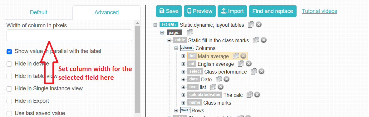
Setting column widths for tables
Users can set the desired width of the columns for reference tables, dynamic tables and static tables. Under the advanced tab for the field to be displayed on a given column, add the desired width of the column on “Width of column in pixels” and save the changes.
This type of field defines a text box which allows the content to be in the format of a date. The supported date format is ‘mm-dd-yyyy’ on the J2ME platform and a date picker is available in Android platform. mm denotes the month, dd denotes the day and yyyy denotes the year.
On the advanced tab, there is an option of setting a maximum or minimum date i.e:
-Enable min/max date: This option allows you to enable either the minimum or maximum date , whereby, the minimum/maximum date is the number of days from the current date. A value of 0 respresents the current date . A negative number is the number of days backwards from the current date ansd positive number is the number of days after the current date.
This type of field creates a relation between the form which contains the “part of” field and another form which; must have been previously defined and saved as a subform, Or could be created right at that very moment. This feature is only supported on the Android Platform and HTML 5 version of mobile client.
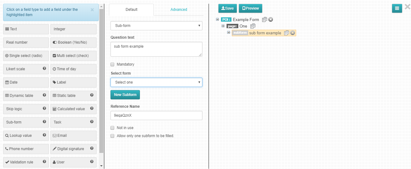
When the sub-form data type is selected, a drop down to select an existing subform form is shown in the attributes panel. You could then select a sub form which is to be linked to the defined question or create a new one by clicking on the ‘New Sub form’ (See illustration on figure 21 below).This action will now link the defined question to the selected questionnaire. On the mobile client application or the data viewer, when this ‘Sub-form’ question is selected, the added sub form will automatically be opened.
Figure 23: Sub-form field
Subform features
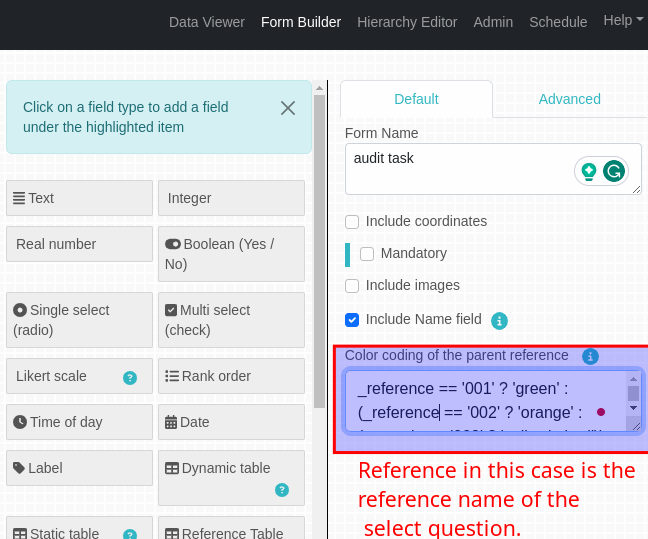
Color coding feature for both subforms and task forms
This feature allows changing the colors of subform/task form buttons based on user input.
Figure 23.1: Task form button changing colors depending on user input
Steps to implement color coding
In the form builder, Go to the form that contains the subform/ task form you wish to implement color coding.
Click on the task form/subform and click open subform.
A field with the title Color coding of the parent reference will appear. This is where we will add our expression.
The expression should be a javascript ternary operator.
For the colors, you can either use the color names or the color codes. Make sure the color is enclosed in quotes. for example:
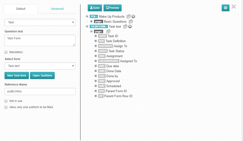
This field also creates a relation between the form which contains the “part of” field and another form which; must have been previously defined and saved as a task form, Or could be created right at that very moment.
Figure 24 : Task field
From the figure above, the Task Form already has some predefined fields set already. The Predefined fields for Task Form include:
Task name- Unique identification of the Task being carried out
Task Definition- More information/definition about the specific task
Task Satus- This is a select question where the user states the status of the task if either it has been assigned to someone, Done, Commented on, Approved or Approved with comments.
Due Date- The specific date when the Task is due
Parent Form ID- The Form that contains this current Task form
Assignment Date- Date when Task was Assigned
Assigned To- The person being assigned the task
Select who should approve- Assign an approver so they can get a notification
Approved by- User who approved the task
Approved Date- Date when the task got the status Approved
Scheduled Date- Date when the task was scheduled to be done
Done date- Date when the Task was completed
Done by- Name of the Person who did the task
Field types mostly used on Task Forms have been defined later on this manual under the sub-topic ‘ IN A FORM’.
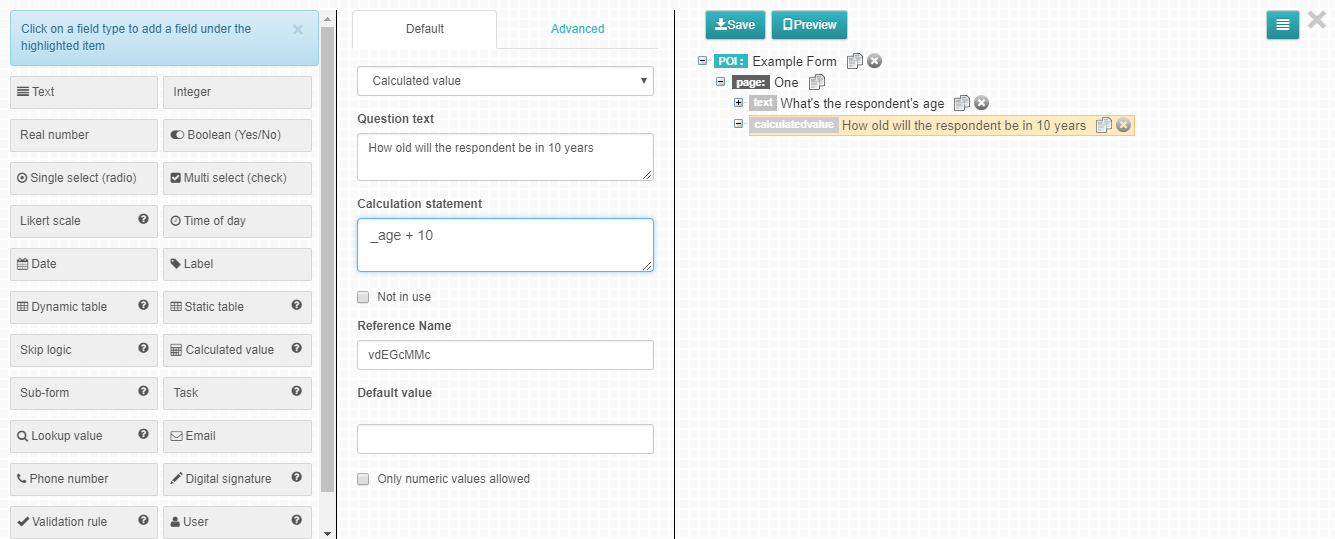
With calculated value question type you can perform mathematical functions on one or several previously defined questions. A calculated value question type requires no manual input on as the values are automatically calculated once all the referenced question fields are filled.
Questions are referenced using Reference names which are prepend with ‘_’ e.g. _age.
Figure 25: calculated value field
Example 1: Incrementing the value entered in a field by a known margin
Suppose we have two questions: what is the respondent’s age? And how old will the respondent be in 10 years?
We can create a calculated value question for the second question such that it automatically adds 10 years to the value entered for the Age question Assuming that the respondent’s age question has an Reference name named age, Below is a sample rule which can be defined:
_age+10
Example 2: Performing a Calculation based on two field values
Suppose we have three more integer questions in the context of a school;
How many boys are in the className?, How many Girls are in the className? and What is the percentage of the number of girls in the className?
We can create a calculated value question to calculate the percentage of girls.
Using the Reference names “numboys” and “numgirls” for number of boys and number of girls questions respectively, we would define the calculation statement as follows:
(_numgirls/(_numgirls+_numboys))*100
Example 3: Concatenating two strings
We can combine two strings e.g. if we have two question fields First name and Last name
We can have a calculated value question Full Names that combines First Name and Last Name.
To do this we would define the rule as follows whereby “first” and “last” are Reference Name for First Name and Last Name respectively. Note that the “ ” is to create a space between the two string values.:
_first+" "+_last
Example 4: Using Calculated Values to calculate the length of a string
Calculated values may be used to calculate the number of characters in a string.
For example to calculate the number of characters entered in a field defined by say a Reference Name “text” one would define a rule as follows:
_text.length
Example 5: Using Calculated Values within a Table Question
Calculated values may be used within a table.
For example, in a table that lists the Number of boys and Girls, we can calculate the total number of students in that className using calculated values.
To get the total number of students using calculated value, we will need to define the rule on the Total column as follows where “nboys” and “ngirls” is the Number of Boys and Number of Girls columns respectively.:
_nboys+_ngirls
Example 6: Calculated question in main form from tables
Calculated questions can also be used to calculate values from the tables to the main form.
For Example: If you want to display the number of boys from the table on the main form, where the table’s reference name is ‘students’, You’ll have the calculated statement on the main form as:
_students.nboys
And the calculated value will display the number of of boys that has been input on the table, directly on the main form.
Example 7: Calculated question in main form from subform
Another way calculated questions can be used is calculating values from a subform in the main form.
For example: If you have a subform with (reference name ‘tools’) that contains a list of items, say, pens, pencils and rulers, and you want to display the value of the pencils field (with the reference name ‘pencils’) on the main form. You can have a calculated question on the main form with the following statement:
_tools.pencils
Example 8: Calculated question in subform from main form
Calculated question can also be used the other way round, to calculate values from the main form to the subform.
For Example: Say you have a main form with a question field Age with reference name ‘age’ that you’d want to be displayed on the the subform, you’ll have a calculated question on the subform with the statement:
_parent.age
Example 9: Using Calculated Values with Math Object Methods
You may perform other functions using any mathematical expressions.
For example to calculate the square root of a value defined by say an Reference Name “val” one would define a rule as follows:
Math.sqrt(_val)
Note 1: An (_) underscore is written before the reference name.
Note 2: The allowable operators are as shown below:
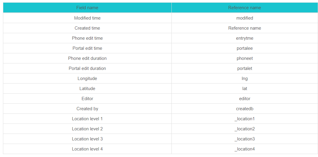
For core fields that are not visible in the Form builder, below are their reference names to be used to refer to them in calculation statements.
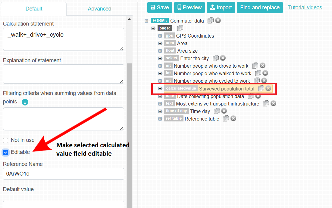
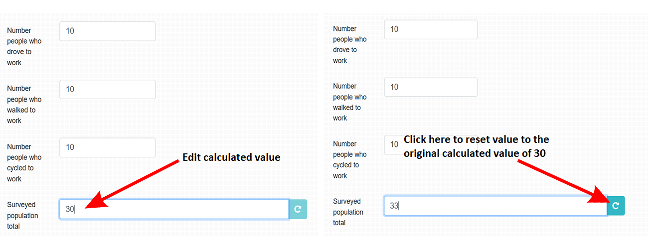
Calculated values can also be edited in the data viewer. To let users change calculated values in the data viewer, check “Editable” on the default tab of a calculated value field type and save .
Figure: Make calculated value editable
Enabling the “Editable” setting will make the calculated value field which is usually not editable, editable. The user can click the reset button against the field to restore the calculated value before any edits were made.
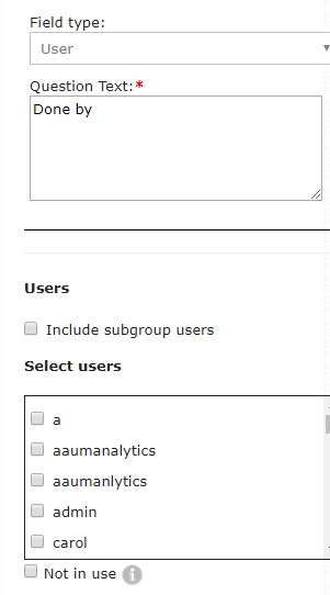
This is a data type used on task forms, forms or subforms to assign users tasks for filling in data points or approve them. When this field type is selected a list of users appear on the attribute panel, where you could select users to be displayed by checking against their usernames or roles. If you select users based on roles, only the usernames of users in your group will be displayed in SIV. If you want to also include users in your sub-group, check “include sub-group users”. See figure 26 below for illustrations.
Note: There is a send notification check box on the advanced Tab of the User question, which when checked, an email notification is sent to the user that has been assigned a specific task and/or seleted to approve a certain task.
As the name suggests, this is a field used for signature purposes. The field consists of four elements , date of signature, a freeze form boolean question, scratchpad area for the signature, and text field for entering name. This field can be filled on the Mobile App and on the portal. If the freeze form question is answered as “yes” when filling in the signature fields, then the user saves the data point, the data point created cannot be edited and will be read only.
This field type uses a set of rules to check data that has been entered and validate if it is correct. If the rule defined returns false, the data is considered invalid.
The rules are defined same as Skip Question Scripts and should evaluate to true for the data to be considered valid.
Example
If for a form to be saved, at least 2 questions with reference names age, gender should have values 15-20 or 25-30 for age and Male for gender, a rule can be defined:
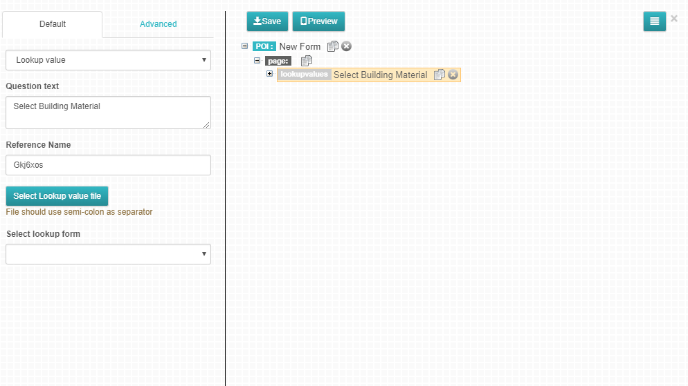
This is similar to Single Select in that it allows a field to be created where the response can only be one of the options defined. The options in this case may have certain attributes and are predefined in a csv file. For example for a question “Select building materials with the following options; Steel, Wood and Bricks” the options can have attributes such as; Cost, Unit Weight and Price. These would need to be predefined in a csv file separated by commas as follows;
Once the csv file is defined, on the Select Building Materials question, select question type as lookup value. On the attributes panel, click on the Select Lookup Value file button then select the predefined csv file from saved location on your computer.
Figure 27: Select Lookup Value csv file
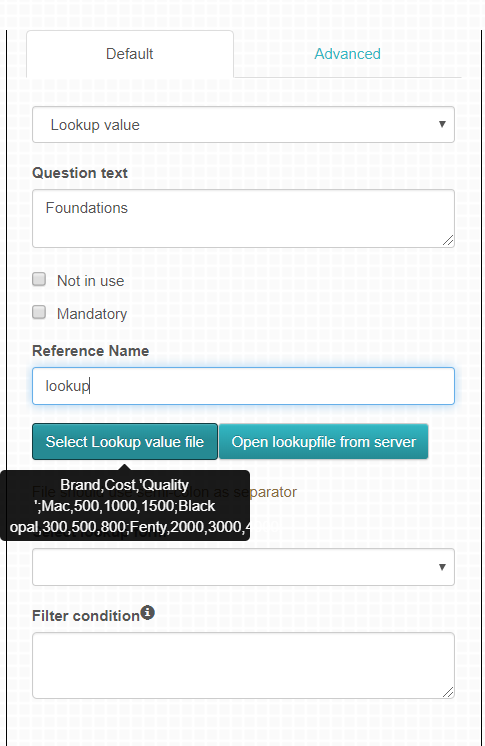
Placing a cursor over the button displays the file content and their attributes in a tabular format.
Figure 25: View Upload csv file
As shown on figure 25, there is an option to select look up form, this a drop down menu that displays a list of forms in the currently active formlist, where you can choose a form that you’d want to use as your look up.
Filter Condition: Condition is validated per row in lookup value file or instance of lookup value form.
If you are using a lookup file, the filter condition is an expression containing reference names of the form. The value of the expression is compared with the value of the second column of the lookup file. If the values are equal, the corresponding value in column one is shown in the selection list.
If you are using a lookup form the truth value of a Javascript expression is evaluted containing the reference names of the lookup form’s or the main form’s fields. To refer to a field in the lookup form, use the expression _x.y where x is the reference name of the current lookup field and y is the reference name the field in the lookup form. If the statement is true then the name of the lookup form instance is shown.
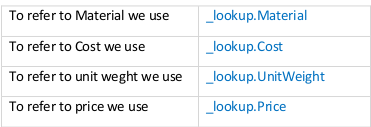
Note 1: Option attributes defined in a lookup value question can be referred to using the reference name of the look up question as follows;
If the reference name is lookup as shown above, we can refer to the any of the option attributes by putting a period after the question’s reference name and indicating the name of the attribute we wish to refer to.
Example:
Note 2: Filter Condition on look up can be used to filter whatever should be shown on the look up file list. The filter conditions checks specific rows to be displayed and this can be done by using the reference name of the look up and the attribute name.
For example to display attributes with only price value of less than 2000, the filter condition will be as follows:
_lookup.price < 2000, where ‘_lookup’ is the reference name of the look up question and ‘price’ is the attribute being checked.
Note 3: Option attributes can be referenced in calculated value questions. For example if we want to know the price of 100 units of Material; we can have a calculated value question “Calculate the price of 100 units of material selected” and define the rule as follows:
_lookup.Price*100
This would get the price of the material selected, multiply it by 100 and display the results.
Note 4: Option attributes can be referenced in skip questions. For example if we want to display certain questions when a particular option is selected; we can define a skip question with a rule as follows:
_lookup.Material
Then add the questions to display when the condition is met under option Yes of the skip question. This would display the defined questions when the option Steel is selected.
To define a form with multiple pages, click on the Add Page button on the field types panel.
Figure 28: Adding a Page
Note 1: The add page button is inactive (grayed out) when there is no open form in the workspace or when neither the form name, nor field nor page of a form in the workspace is highlighted. It is only activated when either the form name, or page or field of a form in the workspace is highlighted.
Note 2: The Add Page Button’s color changes from grey to blue when in active state.
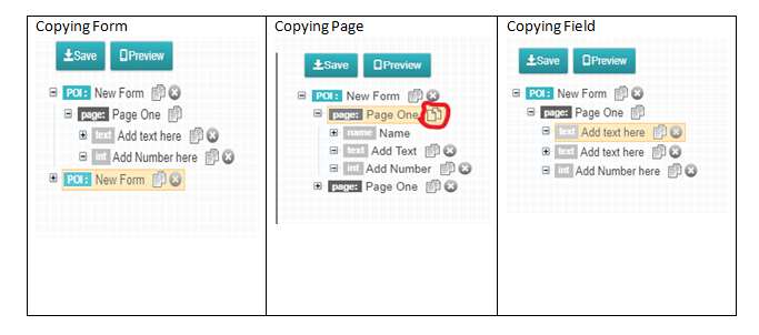
The form builder allows users to copy elements of a form instead of creating new elements. This functionality is ideal if users would like to define similar forms/fields. Instead of recreating a form/page/field, the user can copy a form/page/field and it will be copied and appended at the end of the form. When copying a form/page/field all its children elements will also be copied, their attributes will also remain the same as the original elements.
To copy an element, select a form/page/field then click on ‘Copy’. The copied element will appear at the end of the form tree.
A form can be saved in two ways: locally as an XML file or to the database.
Saving A File Locally in an XML File
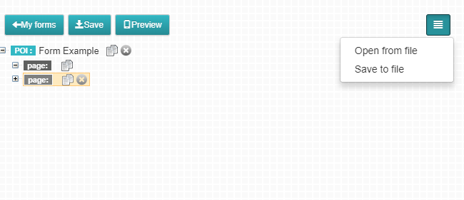
A form can be saved locally as an XML file to create a local back up copy of the form or if there is no internet connection to save remotely in the database. To save a form locally on your file system, select the form and click on the menu button just on the right most part of the workspace the click on Save to file button as shown in figure 28 below.
Figure 30: Saving a form Locally
The form will then automatically be saved in your download folder.
The saved form XML file can later be loaded in the Form builder as explained in section 3.7.1 of this document.
Saving a Form to the Database
A form has to be saved in a database for it to be later used for data collection using the web portal or the mobile client application. To save a form in a database, click save button. A notification message is displayed on the screen “Forms saved …” to show that the save action was successful.
Forms that already exist can be loaded in the Form builder. Forms can exist either in the local machine as XML files or on the database.
Loading a Form from a Local File
There are two ways to load a form that has been saved locally:
1. On the form editor. If you had not saved the file to the database, you can open the form editor by selecting to add an advanced form from the all forms tab or within a form list as discussed in the section about creating a new form.
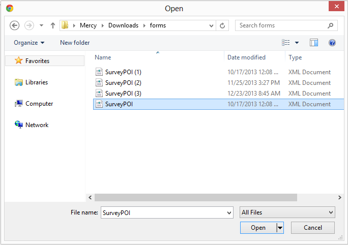
After the form editor page is open, click on the menu button just on the right most part of the workspace then click “open from file”. A window will be displayed containing your local files. Select the xml file on your local folder.
Figure 31: Open from file and dialog window to locate a locally saved form definition file (*.XML).
The form saved locally will be immediately displayed in the work space, delete the form tree for the new form to remain with only the form you opened from your local file. Clicking save will result in a pop up asking to add the form to the current form list. Click yes to add it to the current form list, and no to not associate it to the current form list.
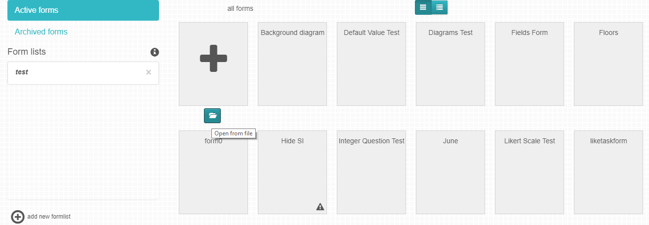
2. From all forms. On the all forms tab, hover over the plus button, you will see a folder icon below it called “Open from file”. Click on it and a dialog window appears allowing the user to select a previously saved poimapper XML file from the local drive, this will open the form and all its nodes on the form editor.
If the form you are selecting from your local xml file had already been saved to the database, you will get a warning that any changes made will affect the already existing form. Therefore, if you click save, the version displayed from your local xml file will overwrite what was on the existing form.
Figure 31.1: Open Form from File
Loading a Form from the Database
Before a form is loaded from the database, it has to have been saved in the database. This is usually done by clicking the save button while on the form editor.
To load a form from a database: click on the Form builder button, the currently active form list will be displayed and the forms it contains will be displayed. Click on any of the forms on the currently active form list to open them. You can also click on another form list to show its forms and open them.
You can also go to the all forms panel and open any of the forms listed.
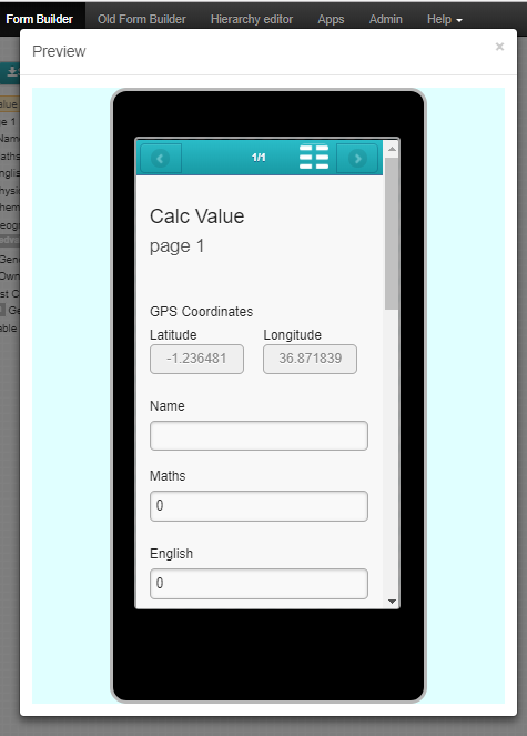
Preview enables one to view a preview of how a form would appear on a mobile device using an app simulator.
To simulate the Form’s fields/questions on the app simulator, select the form you wish to preview on the workspace. Note that one may either load an existing form on the workspace or create a new one. A form is only simulated when on the workspace. After selecting the form, click on the Preview Button as shown in figure 32 below.
Figure 32: Preview Button
Once the Preview Button is clicked, the form is simulated on the app simulator appearing just as it would on the mobile device.
You may want to use or make edits to a form that is on all forms but it might already be deployed, and thus cannot be edited, or you do not have editing rights, or the form is in the library. In those cases, copying the form allows you to create another form from the copied form with the same elements. To copy a form:
Go to all forms or the library.
Hover over the desired form and click on the copy button. This will open the form editor.
Make any changes you want or not then click save.
You will be asked if you want to add the form to the currently active form list, accept.
The form will be saved to the database as a separate form from the original.
This option allows you to add a form template whenever you don’t want to create a form from scratch. The only file type allowed for this operation is csv files, therefore, you should save the form template as a csv file on excel.
The CSV should have three columns: page, field and field type. The first row of the csv file will be treated as a header. You can also have an optional fourth column for adding reference names. The possible question types are integer, float, radio, check, boolean, label, likert, email, user, signature, date, time and text,subform, task, table. Each row in the file is imported as one field. Options can be defined and should be after the select question row. Options have the field type as ‘option’ with option text in the second column.
Form Views define common form templates to be used by different teams in the same organization for different purposes, with some fields being standard across the organization and some specific to a project.
For example, an organization may need to collect data using the same form from different regions but some questions in the form are not relevant to other regions, such may be hidden for the teams/groups which are not required.
A view can also be defined for a different language such that certain teams/groups access the same form in a different language. All forms have a default view which is used if none is defined.
The primary goal of views is to have similar reports across the teams for the common fields i.e. indicators.
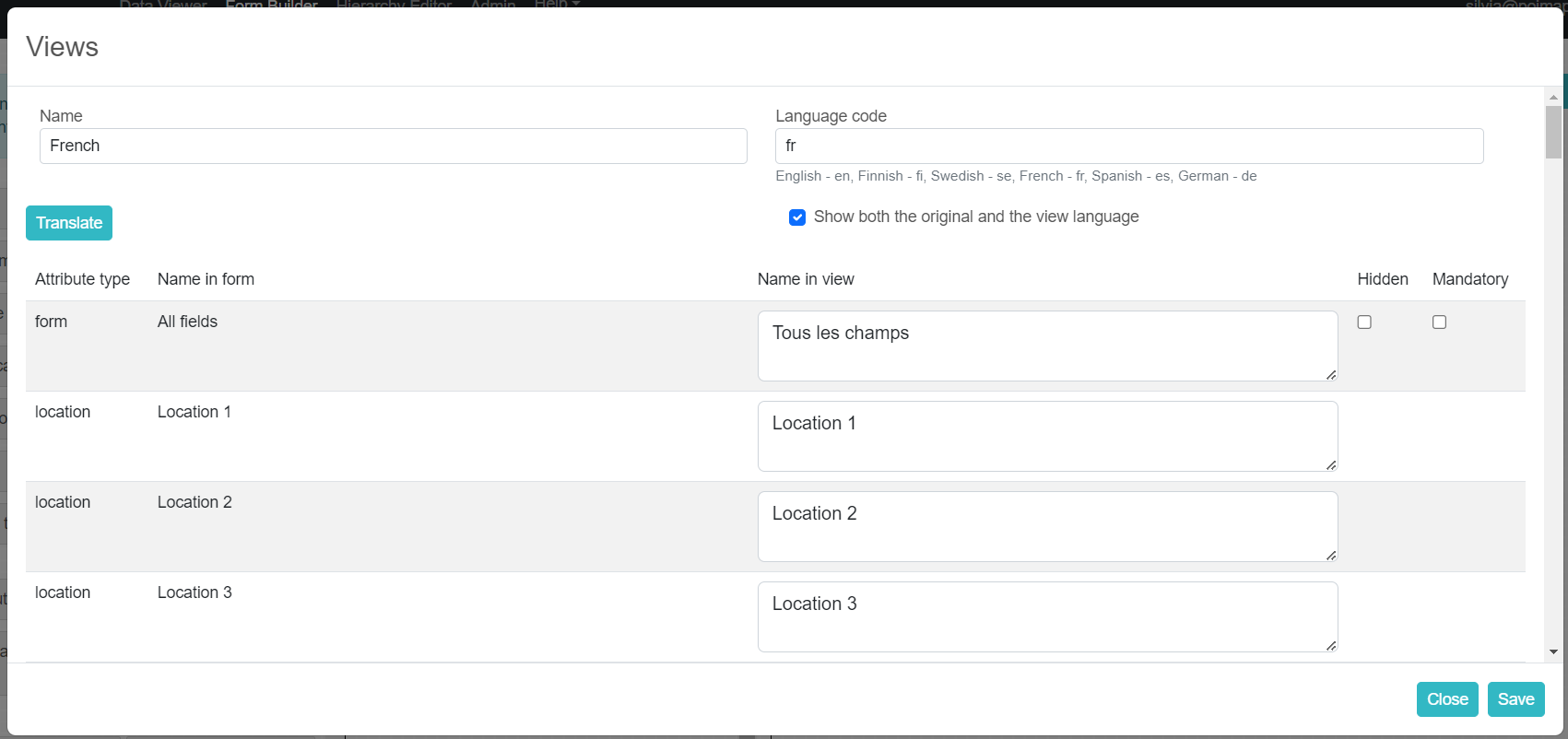
Creating a View
To create a view, click on the form node on the workspace ,navigate to the default attributes panel and click on the views button. You’ll then click add new view from the resulting dialog.
Figure 33: Creating A View
Enter a name for the view and in the Name in View Column, change the question text as you want it to appear in the in view.
If you want the form to be displayed in another language, you must select the language you intend to translate to from the language code drop down. This will allow users on the mobile phone to see the forms in the language if their phone’s language matches it. The users on the web portal can also switch to the form language on the data viewer.
The translations can be entered either manually or using the translate button. After selecting the language code, the translate button will become clickable. If you click the translate button,the system will fill in all translations for you.
In some cases, you may wish to show users the original language that was used while creating the form questions(this will appear in brackets), in addition to the translations. To do so, check the option ‘Show both the original and view language’.
You may also choose to hide or make some questions mandatory . This can be done by checking appropriate checkboxes in the hidden and mandatory columns.
For look-up questions, you can attach a lookup file that contains a csv with translations of the original form langauge csv.
Once satisfied click on save to save the changes made to views and click save on the form editor to save to the database.
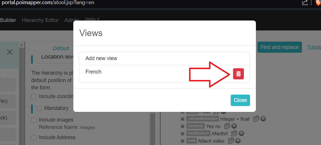
Opening an Existing View
To open a previously saved view, highlight a form with a view on the workspace then click on Views from the attributes panel then select the view you wish to open from the available list.
Deleting a View
To Delete a View, open it and click on the delete button as shown on the figure below. Then confirm the deletion and save the form to the database.
Figure 33.2: Deleting a View
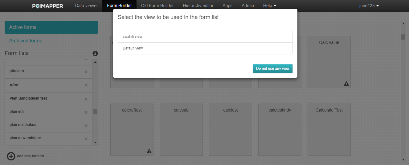
Associating a Form to a View in Formlist
In order for the organization teams/groups to use the created form views, the view to be used must be specified while adding the form to a formlist that is associated with the team/group. A formlist basically allows forms to be visible in the Data Viewer and Mobile Client. Formlists are explained later in this document.
To associate a form to a view, go to all forms panel and locate the form ( use the search bar to find it if there are lots of forms). Drag the form with different views then drop it on the designated formlist, and a pop up to choose which views you want activated will appear. If you had defined two or more views with the same language code, you can only select one at a time for the same form list.
Forms that are saved to the database are only archived or Hidden permanently
New forms that have not been saved to the database can be deleted by clicking the X button next to the form name on the work space. Deleting new forms causes permanent loss of them.
If a form is loaded from the database and edited in the workspace, clicking the X button next to the form name, you will be prompted to save the form or just exit without saving it which causes loss of latest edits in the form but the previous version of the form remains as was in the database.
To Archive, right below each form, if you hover over one, there is a button to archive a form right next to the copy button. Figure below shows how to archive a form.
Figure 34: Archive Form
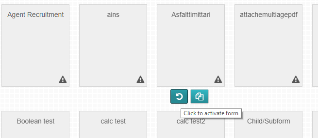
To restore archived forms, switch from Active to Archived on the left panel then hover over the form and click on the activate button right below the form name next to the delete button.
Figure 34.1: Restore Archived Forms
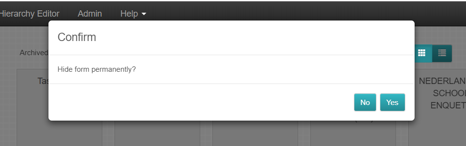
There is also an option to hide form permanently, and this option is available for forms that have already been archived. To do this, you’ll switch to the archived form panel, then click on the ‘delete’ icon and you’ll then be prompted to hide the form permanently.
To view forms in data viewer and the mobile client application, the forms must be added to a formlist and the formlist associated to a group (Associating formlists to groups is explained in the Admin Tool Manual).
Only one formlist may be selected to contain forms that will be viewed in the data viewer and mobile client application.
Creating a Form list and Adding Forms to Formlist
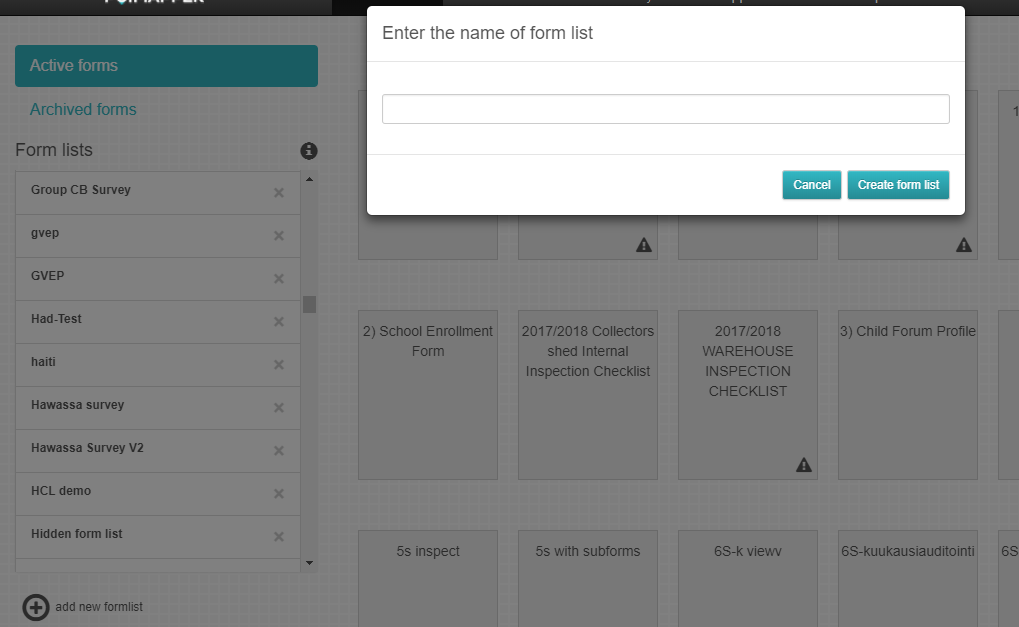
To create a new formlist, click on the ‘add new formlist’ button that is right below the list of formlists on the form builder. A dialog box to enter the formlist name will appear as shown in the figure below.
Figure 35: new formlist
A new form list will then be created and automatically added to the list of formlists.
To further add forms to a formlist after it has been created, simply click on the form from the list of forms on all forms, drag it the drop it on the name of the created formlist.
Note 1: While adding a form to a formlist the default view is used if none is selected.
Note 2: To remove a form from the formlist select the form list then click on the x button that is displayed righ below the form.
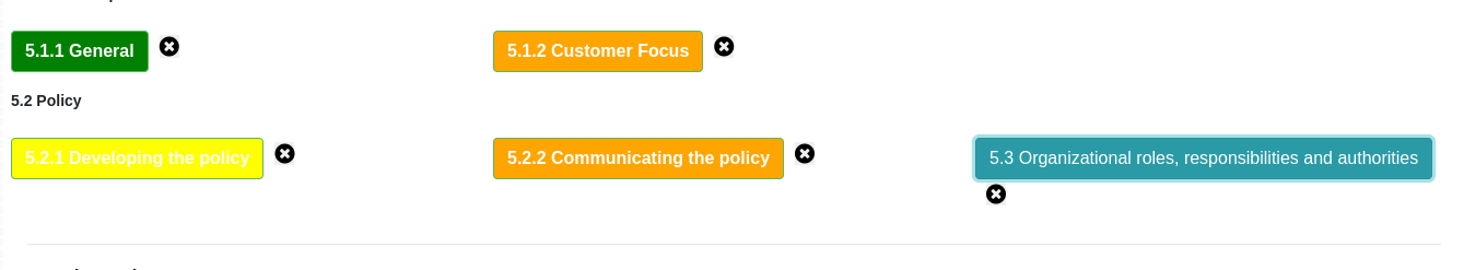
Note 3: To view forms in a specific formlist, click on the formlist and the list of forms will appear. Click on the x button on the top right part to close the formlist
Deleting Formlist
To delete a formlist, click on the X button next to the formlist name on the form list panel and accept the prompt. Note that you can’t delete the currenlty active formlist. If you wish to delete it, change the active form list, then delete the previosuly active form list.
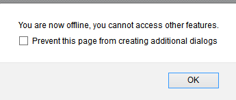
The form builder supports offline access such that one can access the form builder, create forms and save form locally without requiring internet connection. However for this to work the form builder must have been previously loaded on the browser during a session with internet connectivity to facilitate files caching.