Generating reports and charts
Reports
The data viewer panel contains a reporting tool, which allows you to generate reports of collected data into tables in pdf, excel and word document format. To use this reporting feature:
Click on the ‘Reports’ button on the top right of the window and a pop up will appear as shown in the following figure 30 below:
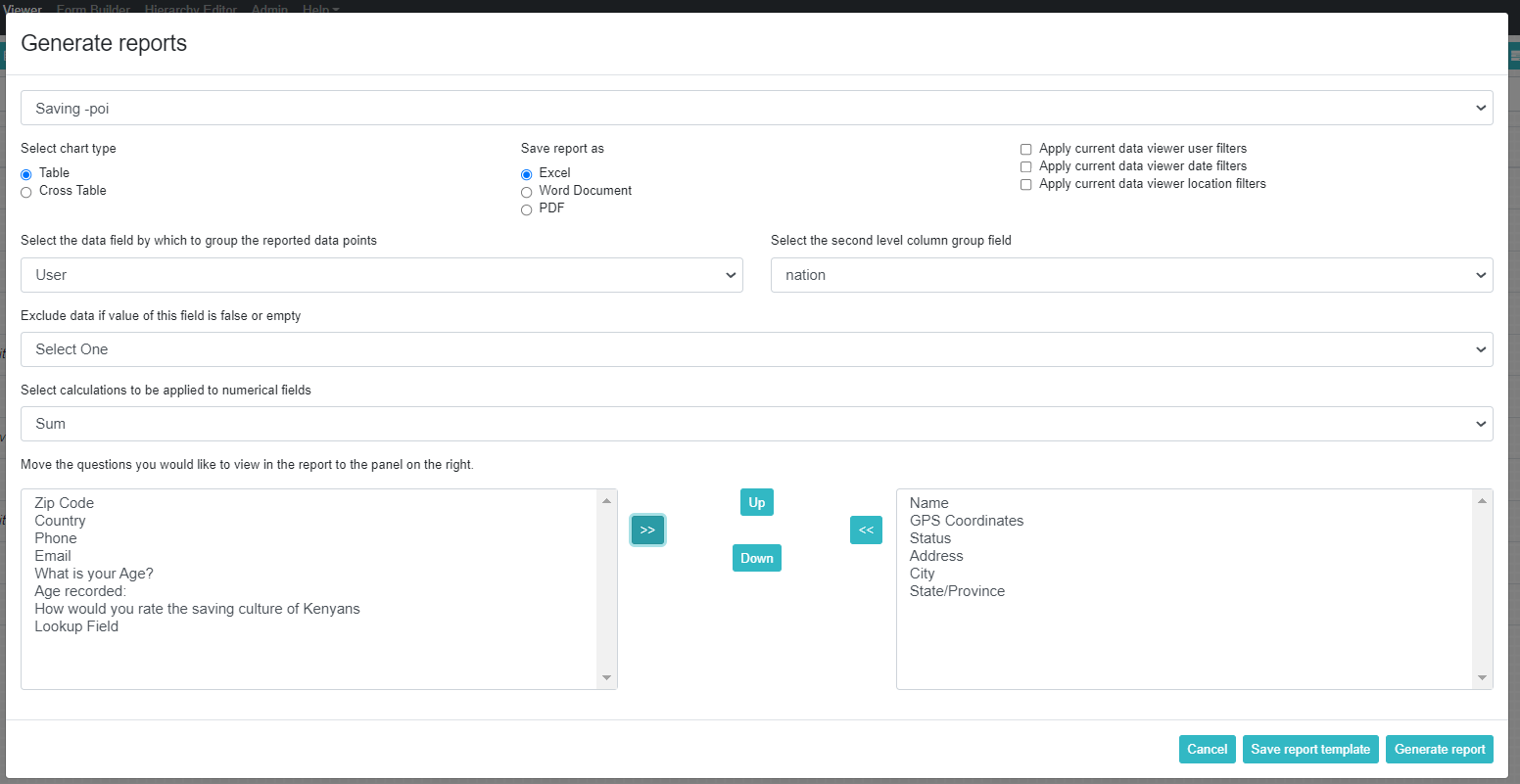
Figure 31: Generate Reports
b.Select a form containing data then all the questions belonging to that form will be displayed on the bottom left panel.
c.Select the type of report you would like to include in the report, the following report types are available:
Table
Cross Table
For all report type generation, you may:
- Apply Current Data Viewer User Filters:
When this option is checked the user filters selected previously on the data viewer (see Section on Data Filtering) will be applied to the data of the generated report. This means that only data collected or modified by the filtered users will be visible in the report.
- Apply Current Data Viewer Date Filters:
When this option is checked the date filters selected previously on the data viewer (see Section on Data Filtering) will be applied to the data of the generated report. This means that only data collected or modified within the specified period will be visible in the report.
- Apply Current Data Viewer Location Filters:
When this option is checked the location filters selected previously on the Data Viewer will be applied to the data of the generated report. This means that only data collected or modified by the selected locations will be visible in the report.
Table: A tabular representation of the data
When table format is selected the following options may be included:
Show location names for each data instance:
When this option is checked the location hierarchy of each data instance is included in the report.
Select the data field by which to group the reported data points:
It is possible to group data in the report based on the following types of fields
Location (Location hierarchy)
Option questions (Multi-select, Single-select and Boolean)
Name (the unique identifier for each question)
User (the person who collected the data)
Exclude data if value of this field is false or empty:
This allows you to decide which field in the form you don’t want to appear as blank in the report. This feature can also be used to control with some calculation logic which data is show, as you can defined a calculation statement that gives the value false based on desired conditions.
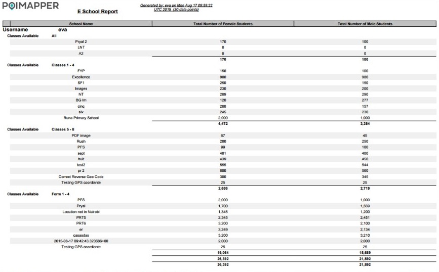
Figure 32: Table Report
Select calculations to be applied to numerical fields:
Sum or average calculations may be applied to numerical fields.
Cross tabulated report
This form of report allows users to display numerical data on a table organized by two fields.
Select the column group field:
The column group represents the question which will be displayed as the table columns. This question must either be a single/multi-select question, location question, name question or editor question.When a column group field is selected, the report is generated based on the column group field.
Select the row group fields:
The row group field represents the question which will be displayed as the table rows. This question must either be a single/multi-select question, location question, name question or editor question.
Select calculations to be applied to numerical fields:
The calculations to be applied option allows users to select the type of calculation which will be applied to the numerical questions in the report. Sum, percentageor average calculations can be applied to numerical fields in the cross table report.
The bottom-left panel only shows the numerical questions in the questionnaire which can be included in the report.
After the above parameters are set, the report can be generated. For the above example, the report looks as follows:
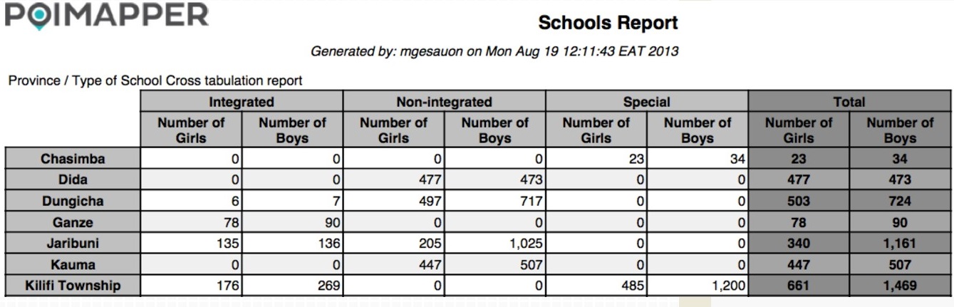
Figure 33: Cross tabulated report
Note that the reports are generated according to size A4. It is recommended that you specify the number of questions (columns) which would fit on an A4 page in a tabular format.
Select the questions which will be displayed on the report by select the questions on the bottom-left panel and click on the ‘>>’ button. The questions will be moved to the right panel, meaning that these questions will be included in the report.
Generate the report by clicking on ‘Generate Report’ button. A word, excel or pdf file will be downloaded to your desktop as per your selection.
Predefined report templates
A user can define report templates using the Generate Report dialogue and store the template for later use. This is particularly useful if several persons should use the same reporting template, then just one person can define the standard template to use and another user can just select it from a selection list of predefined reports.
To save a report template:
Click on the ‘Reports’ button.
Select all necessary fields as explained in the previous section for generating reports.
Click on the ‘Save Report Template’ button.
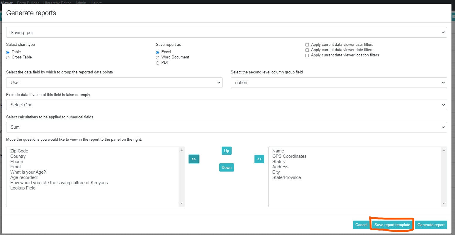
Figure 34: Save Report Template
A pop up will appear prompting the user to enter the name of the defined report template as shown below on figure 34.
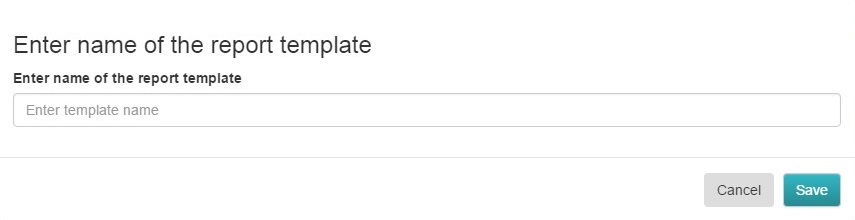
Figure 35: Name Report Template
After saving the report template, it can then be selected from a selection of predefined reports, as shown below on figure 35.
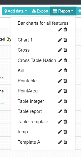
Figure 36: Select Saved Reports
Charts
Charts are generated using the + button next to the Charts button. A popup appears to select the type of chart. The available chart types are:
Bar charts for numeric fields
Bar charts for choice fields
Line curves for numeric fields
Line curves for choice fields
Pie charts.
Radar charts
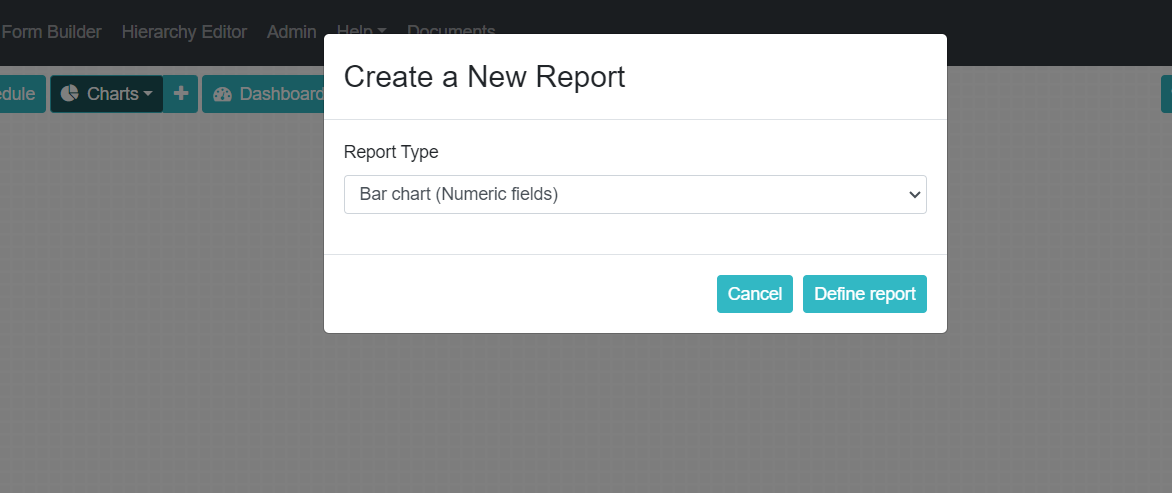
Figure 37: Selection of chart type
After selecting the chart type, the user should select one or a combination of any of the following: a form, a subform or a table to be included in the chart. After that, the user should select the fields to be included in the charts. The available fields depend on the type of chart selected:
For charts based on numeric fields, any integer, real and calculated values in the forms, subforms or tables selected (defined as numeric only fields) are included.
For charts based on choice fields, any single choice, multichoice and text fields with validation lists in the forms, subforms or tables selected are included.
The x-axis choice defines criteria by which the data is shown in the chart on an axis that can be vertical or horizontal.
In the chart settings menu it can be defined if non-response values should be excluded or if the bar charts should be shown horizontally or vertically (also called column charts).
If the form includes locations and the location has not been used as the x-axis the data can be grouped by location, meaning that a separate chart is rendered for each location based on the selected location level.
When moving the mouse on bar or linecurve, a pop up appears on the chart’s points. It has a “View datapoints” button. If clicked, the data points included the bar /linecurve point are listed and are clickable.
Select combination drop down allows combining charts of all selected fields into one chart.
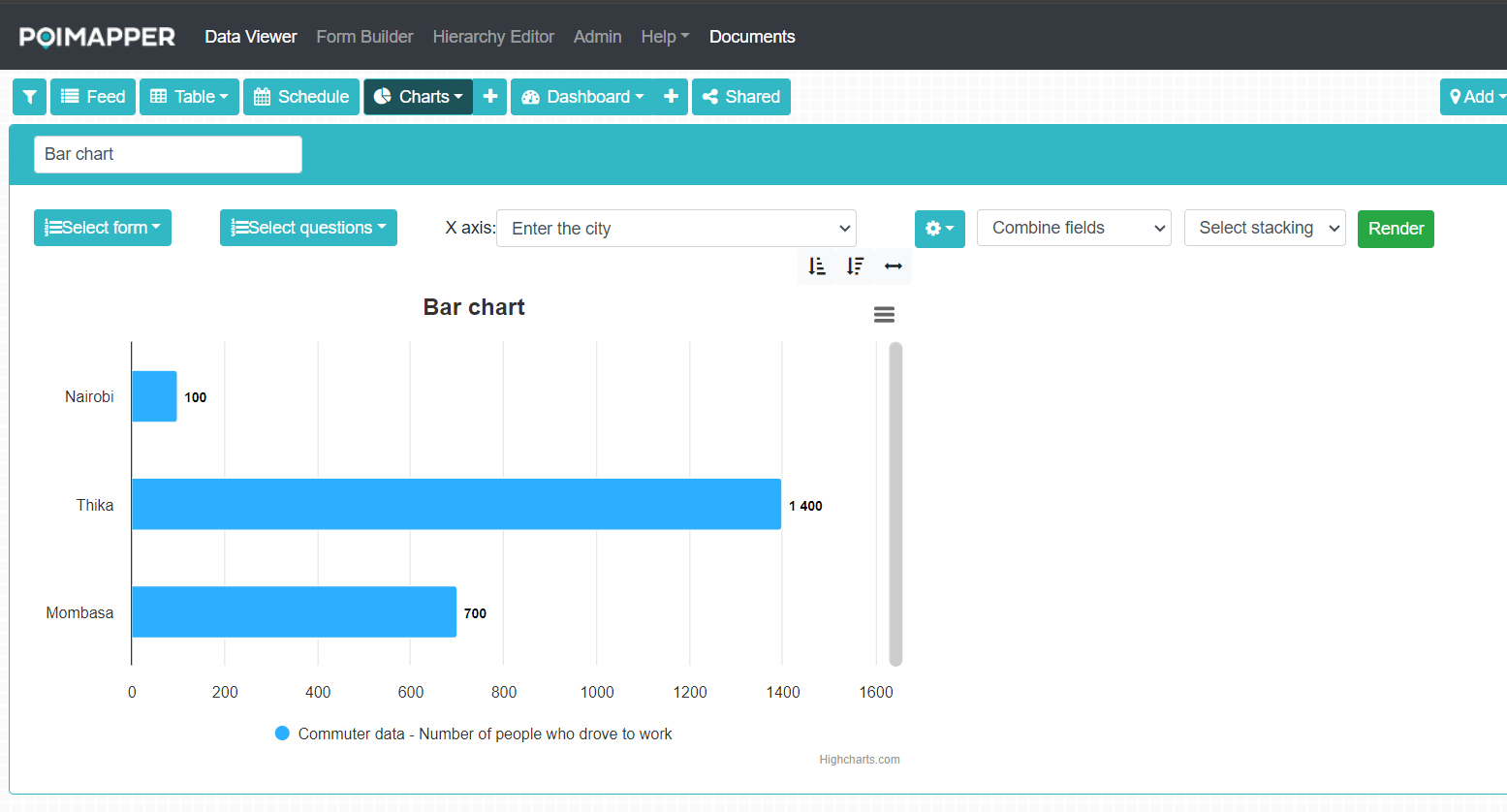
Figure 38: Defining a bar chart
Select stacking allows stacking of choice options into one bar. This useful in combination with selecting combination of charts, then each bar represents one choice fields with the count of each choice shown with a different color in the bar.
By selecting the horizontal arrow symbol for bar charts in the upper right corner of each chart, the choice field options and x-axis choice can be switched for easy comparison of alternative ways of visualizing the same data.
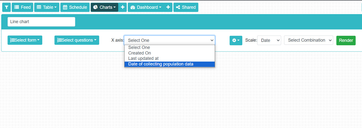
Figure 39: Switching x-axis and choice options in the chart
For line charts only time based x-axis fields are enabled, including the form specific date fields. The line chart values can be aggregated based on day, week, month or year.
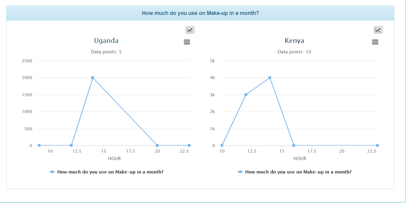
Figure 40: Defining a line chart
If a user has chosen the Radar chart from the chart selection dropdown, the empty chart displays a message, “3-8 numeric fields can be added,” which will be shown until three fields have been selected and the render button is clicked.
After clicking render, the radar diagram is drawn according to the number of fields selected with equal angles between the axis. Note that a user cannot add more than 8 fields.
Fields can be added and removed with a checkbox in front of the field or alternatively by clicking on the field in the list of all fields, thus giving it a “selected” colour.
There is a button ‘Add lines’ with a drop-down that shows a scrollable list with a text search of the data points of the selected form, from which a multiple-choice selection can be made. Each selected data point is then shown as a radar line, each coloured separately, and labels show the line (data point) names per colour. Note that only five lines can be added.
When adding or removing a new data point, the axis scales may have to be adjusted, meaning that the whole chart has to be rendered again.
When moving the mouse on the line the datapoint name is also shown.
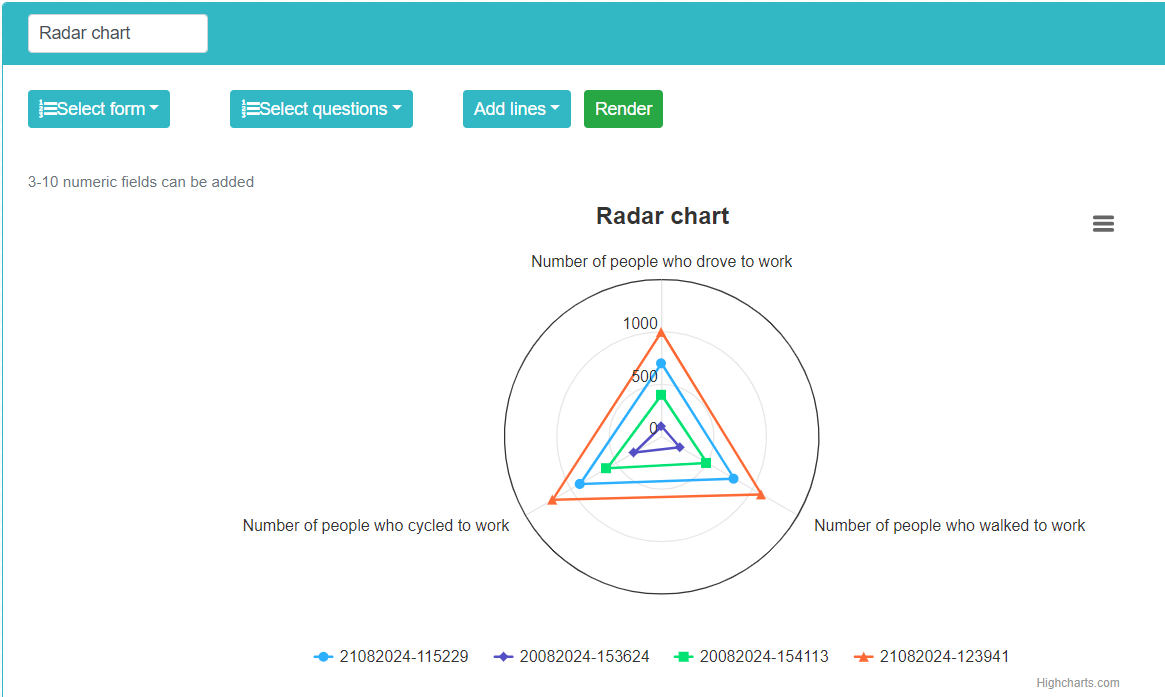
Figure: Defining a radar chart
The charts can be individually printed as images by selecting the hamburger icon on the upper right corner of each chart.
By selecting the arrow icon in the upper right corner of line charts the cumulative curve is shown.
Once the chart has been defined and the verified to contain useful data, the Done button can be clicked to export or save the chart.
The chart can be exported as as PDF containing all the charts generated with one chart definition, for instance one chart per location, by clikcing the PDF icon.
The chart can saved and named by clicking on the Save icon. A default name for the chart is suggested, but it is usually better to define a more specific name for future reference.
After the chart has been done, the same chart can be used to visualize the data with different filtering conditions by clicking on the Apply Filters button.
Later on by clicking on the Charts drop down a predefined chart can be selected for visualizing the data. Clicking on the Pen icon an existing chart can be modified.